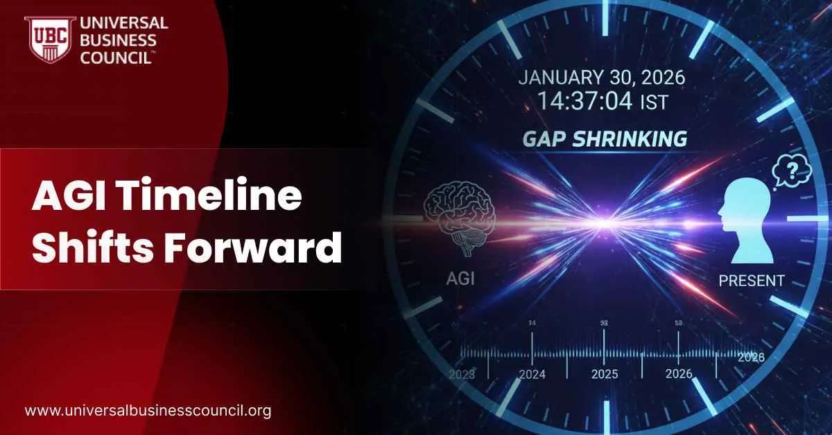
The AI conversation in 2026 is no longer led by model launch hype alone. It is being shaped by charts that show where real usage, money, labor, and infrastructure are moving. These charts explain adoption far better than a few viral demos, because they reveal where value is already landing and where new pressure is building across the economy.If you want to track these signals with a stronger foundation, start with anAI certification. It helps you read these charts like a systems operator, not like a spectator, because you learn how tokens, inference, deployment, and incentives connect in real products.This article walks through 15 AI charts to watch in 2026, based on deployment patterns, enterprise surveys, infrastructure investment, and the observed shift in how people work with AI. Each chart highlights a different pressure point in the AI ecosystem, from reasoning workloads to ROI, jobs, compute, and enterprise strategy. If you are building roadmaps or making adoption bets inside a company, building infrastructure literacy through aTech certification can help you translate these signals into decisions that hold up in production.Below are the charts that will matter most in 2026.
1. Reasoning Tokens as a Share of Total AI Usage
What the chart shows The share of total tokens spent on multi-step reasoning versus short, direct responses.Key data point Reasoning tokens crossed roughly 50 percent of total usage by November 2025.Why it matters This is a behavior shift. It signals that AI is increasingly being used for planning, analysis, and decision support, not just quick chat answers. That changes cost profiles, latency expectations, and product design.What to watch in 2026 Whether reasoning share keeps rising or stabilizes as organizations push for lower inference cost and faster response times.
2. Task Duration AI Can Complete Reliably
What the chart shows The maximum length of tasks AI systems can finish end-to-end while staying reliable.Key data point Task duration has been doubling every 4 to 7 months at both 50 percent and 80 percent success thresholds.Why it matters This is one of the cleanest signals for whether AI is moving from “helper” to “workflow finisher.” Longer task completion means more automation potential, and also higher risk if guardrails are weak.What to watch in 2026 Whether reliable task duration crosses from hours into multi-day work, and whether companies trust those systems in real operations.
3. Long Context Accuracy Drop-Off
What the chart shows How accuracy changes as context windows expand from 8K to 128K to 256K tokens.Key data point Older models fell from about 90 percent accuracy at 8K to below 50 percent at 256K. Newer models stayed near 100 percent across long context.Why it matters Long context is only useful if accuracy stays stable. If the model loses the plot as context grows, bigger windows just create longer, more confident mistakes.What to watch in 2026 Which providers maintain reliability at large context sizes without relying on fragile prompt hacks.
4. Efficiency Gains on Abstract Reasoning Benchmarks
What the chart shows Performance per unit of compute on abstract reasoning tasks.Key data point Efficiency improved by roughly 390 percent between earlier GPT variants and GPT-5.2 class models.Why it matters This suggests intelligence gains are increasingly coming from training methods and inference optimization, not just bigger budgets and bigger clusters.What to watch in 2026 Whether the efficiency curve continues upward or slows as the easiest wins get exhausted.
5. Cost vs Performance of Mid-Tier Models
What the chart shows The cost-performance tradeoff for mid-tier models, such as Gemini 3 Flash compared with earlier Pro-class models.Key data point Comparable performance delivered at roughly one-third the cost.Why it matters Mass adoption usually follows affordable quality. Many companies will pick “good enough and cheap” over “best and expensive,” especially at scale.What to watch in 2026 Whether cost compression continues, and whether pricing pressure forces changes in business models across AI vendors.
6. Data Center Construction vs Office Construction
What the chart shows Square footage growth for data centers compared with commercial office construction.Key data point Data center construction overtook office construction by mid-2025.Why it mattersAI is changing the physical economy. Compute demand drives land, power, cooling, permitting, and regional policy decisions. This is not just software spending.What to watch in 2026 Power constraints, transformer shortages, permitting timelines, and regional bottlenecks that slow buildouts.
7. Compute Growth Sensitivity Curve
What the chart shows How small changes in compute growth shift capability timelines.Key insight Slower compute growth can delay major capability milestones by years, not months.Why it matters This explains why hyperscalers overbuild. If growth slows, timelines slip hard. If growth holds, leaders widen the gap.What to watch in 2026 Whether energy constraints, GPU supply, and data center delays flatten the growth curve.
8. AI Spend Split Between R&D and Inference
What the chart shows How major AI labs allocate spending between research and serving live users.Key data point A representative 2024 split showed about $5 billion on R&D versus $2 billion on inference.Why it matters High usage can become a trap if inference costs grow faster than revenue. If serving dominates, it can starve research and slow next-generation progress.What to watch in 2026 Whether inference spend catches up to, or overtakes, research spending, and what that does to release velocity.
9. Circular Capital Flows in AI Deals
What the chart shows Investment loops, compute commitments, revenue guarantees, and strategic contracts between major AI players.Why it matters These structures can speed up the buildout, but they also raise questions about sustainability and how much of the market is real demand versus financing design.What to watch in 2026 Whether these arrangements unwind cleanly, normalize into a standard playbook, or create stress events when growth slows.
10. AI Revenue Growth Slopes
What the chart shows Revenue growth trajectories over time, not just headline totals.Key data points One major lab rose from $1B to $8B to $9B annualized in 2025. Another grew from $4B to $13B to $14B in the same period.Why it matters Slope signals momentum. A smaller company with a steep slope can matter more than a larger company with a flattening curve.What to watch in 2026 Which curves flatten first, and which ones keep compounding.
11. Enterprise Model Share for Coding and Knowledge Work
What the chart shows Default model adoption inside large organizations for coding-heavy and knowledge workflows.Key data point One provider captured roughly 40 percent of enterprise usage in coding-heavy environments.Why it matters Defaults compound. Procurement, internal training, tooling integrations, and developer habits reinforce the leading choice, making it hard for challengers to break in.What to watch in 2026 Whether challengers win share through better integrations, pricing, or reliability for enterprise constraints.
12. AI ROI Distribution Across Companies
What the chart shows How many companies report positive ROI versus negative ROI from AI.Key data points 82 percent report positive ROI. About 5.5 percent report negative ROI. 96 percent expect positive ROI within 12 months.Why it matters This is the chart that ends the “it’s all hype” argument. AI is producing measurable value for most organizations, even if the value is unevenly distributed.What to watch in 2026 Whether ROI becomes concentrated among leaders, or spreads as best practices get copied.
13. ROI vs Breadth of AI Benefits
What the chart shows The relationship between ROI and how many categories of benefits a company achieves.Key data point Narrow adopters averaged about 3.13 ROI score, while broad adopters reached around 3.65.Why it mattersAI pays more when it is applied across multiple functions. The “portfolio effect” matters. Isolated pilots rarely create compounding gains.What to watch in 2026 Whether companies expand AI across departments or pull back to a smaller set of safer wins.
14. Assistants vs Agents Spend Ratio
What the chart shows How budgets split between copilots and more autonomous agent systems.Key data points Assistants receive roughly 10 times more spend than agents. Usage split shows 57 percent assisted, 30 percent automated, 14 percent fully agentic.Why it matters Organizations are still cautious about autonomy. They want productivity boosts without losing control or creating new failure modes.What to watch in 2026 Whether agent spend rises meaningfully, and what unlocks it (better evals, better tool standards, better governance).
15. Entry-Level Employment vs AI Adoption
What the chart shows Youth employment trends alongside AI adoption curves.Key data point Youth unemployment reached its highest level since 2015, excluding the COVID period.Why it matters This chart drives politics, education policy, and corporate workforce planning. Entry-level roles are often where routine work lives, and that is where automation pressure shows first.What to watch in 2026 Whether new pathways appear fast enough to replace old entry-level tracks, and how companies redesign early-career development.
Closing Perspective
These 15 charts form a practical dashboard for 2026. They show AI moving from novelty to infrastructure, from small experiments to embedded workflows, and from isolated tools to systems that alter budgets, hiring, and competition.At this stage, outcomes are shaped as much by adoption decisions and organizational execution as by raw model capability. That is why strategy, communication, and change management matter more each quarter, and why many leaders study frameworks through aMarketing and business certification to align AI deployment with trust, incentives, and real business outcomes.
 The AI conversation in 2026 is no longer led by model launch hype alone. It is being shaped by charts that show where real usage, money, labor, and infrastructure are moving. These charts explain adoption far better than a few viral demos, because they reveal where value is already landing and where new pressure is building across the economy.
If you want to track these signals with a stronger foundation, start with an AI certification. It helps you read these charts like a systems operator, not like a spectator, because you learn how tokens, inference, deployment, and incentives connect in real products.
This article walks through 15 AI charts to watch in 2026, based on deployment patterns, enterprise surveys, infrastructure investment, and the observed shift in how people work with AI. Each chart highlights a different pressure point in the AI ecosystem, from reasoning workloads to ROI, jobs, compute, and enterprise strategy. If you are building roadmaps or making adoption bets inside a company, building infrastructure literacy through a Tech certification can help you translate these signals into decisions that hold up in production.
Below are the charts that will matter most in 2026.
The AI conversation in 2026 is no longer led by model launch hype alone. It is being shaped by charts that show where real usage, money, labor, and infrastructure are moving. These charts explain adoption far better than a few viral demos, because they reveal where value is already landing and where new pressure is building across the economy.
If you want to track these signals with a stronger foundation, start with an AI certification. It helps you read these charts like a systems operator, not like a spectator, because you learn how tokens, inference, deployment, and incentives connect in real products.
This article walks through 15 AI charts to watch in 2026, based on deployment patterns, enterprise surveys, infrastructure investment, and the observed shift in how people work with AI. Each chart highlights a different pressure point in the AI ecosystem, from reasoning workloads to ROI, jobs, compute, and enterprise strategy. If you are building roadmaps or making adoption bets inside a company, building infrastructure literacy through a Tech certification can help you translate these signals into decisions that hold up in production.
Below are the charts that will matter most in 2026.


Leave a Reply