

Six Sigma Control Charts Explained: Monitoring Process Stability
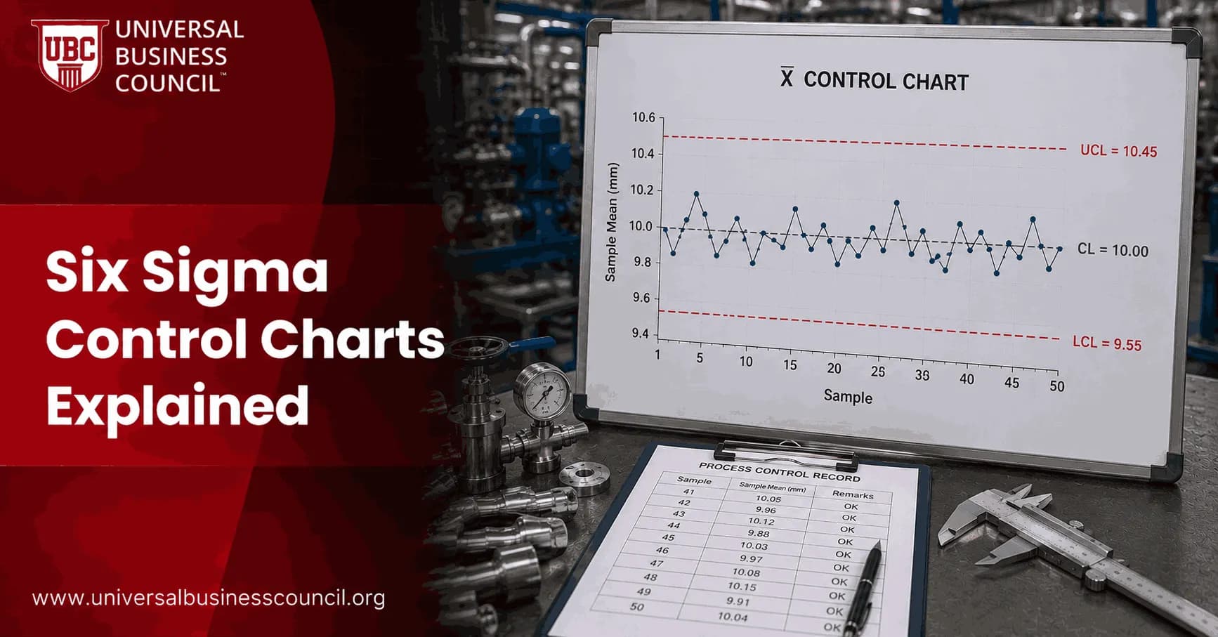
Six Sigma control charts show whether a process is stable enough to manage, improve, and trust. They plot process data over time against a center line and calculated control limits, so you can separate normal variation from signals that something has changed. That sounds simple. In practice, it stops a lot of bad decisions.
I have watched teams adjust a filling machine three times in one shift because two measurements looked high. The control chart later showed both points were still inside expected variation. The extra adjustments created a bigger spread than the original issue. That is exactly the kind of tampering control charts help prevent. If you are building this discipline from scratch, the Certified Six Sigma Expert program is a useful reference point for how control chart theory should fit into a broader curriculum.

What Are Six Sigma Control Charts?
A control chart, sometimes called a Shewhart chart or process behavior chart, is a time-ordered graph of process measurements. Walter A. Shewhart developed the method at Bell Telephone Laboratories in the 1920s, and it remains a core tool in statistical process control, or SPC.
Most Six Sigma control charts include a few parts:
Center line: Usually the process average, based on stable historical data.
Upper control limit: The upper boundary of expected common cause variation.
Lower control limit: The lower boundary of expected common cause variation.
Data points: Measurements plotted in the order they occur.
Control limits are not customer specification limits. This point trips up many certification candidates. A process can be statistically in control and still produce items outside specification if its natural variation is too wide. Stability comes first. Capability comes next.
Why Control Charts Matter in Lean Six Sigma
Six Sigma is built on measured improvement, not guesswork. Control charts support that discipline by showing whether variation is routine or unusual. They earn their place across the DMAIC cycle. As this discipline expands into general operations and leadership work, it is also worth browsing the broader Management Certifications catalog, since much of what a control chart teaches about process stability applies well beyond the factory floor.
Measure Phase
Use a control chart in Measure to understand the baseline. Before you calculate capability or promise savings, ask a blunt question: is the process stable? If it is not, your Cp, Cpk, DPMO, or defect rate may mislead you, because the process is still changing.
Improve Phase
After a process change, the chart helps you see whether the average shifted, variation decreased, or both. A before-and-after comparison is stronger when it rests on stable chart behavior rather than a single good week.
Control Phase
This is where control charts earn their keep. In the Control phase, teams use them to confirm that gains hold. Operators, analysts, and managers can spot early warning signs before defects reach customers.
For professionals building formal skills, this topic connects with Six Sigma, Lean management, quality management, and operations courses in the Universal Business Council certification catalog.
How to Build a Control Chart
You do not need to make this mystical. The mechanics are straightforward, though the subgrouping choices matter.
Select the critical quality characteristic. Pick a metric that matters, such as cycle time, defect proportion, fill weight, API latency, or invoice error rate.
Collect data in time order. Do not sort the data by size. You need the process sequence.
Choose the right chart type. Match the chart to the data type and sampling plan.
Calculate the center line. This is usually the process mean or average proportion.
Calculate control limits. Traditional Shewhart charts commonly use limits set at plus or minus 3 sigma.
Review patterns. Look for points outside limits, long runs on one side of the center line, trends, cycles, or sudden shifts.
Investigate special causes. Use tools such as the fishbone diagram, 5 Whys, Pareto analysis, or direct process observation.
A practical warning: if your first dataset includes a known equipment failure or a holiday staffing exception, do not blindly bake that into your control limits. Clean the baseline only when you have a documented reason. Otherwise you may remove the very signal you need to study.
Common Types of Six Sigma Control Charts
The chart you choose depends on whether your data are continuous or attribute-based.
X-bar and R Charts
X-bar charts track subgroup averages over time. R charts track the range within each subgroup. Together, they are common in manufacturing, lab testing, packaging, and any process where you collect small samples at regular intervals.
Take an example. An operator weighs five cups every 30 minutes. The X-bar chart shows whether average fill weight is moving. The R chart shows whether short-term variation is widening.
P Charts
A P chart tracks the proportion of defective units in a sample. Use it for attribute data, such as the percentage of claims with errors or the share of software tickets reopened after release.
Individuals and Moving Range Charts
When you have one measurement at a time, use an Individuals and Moving Range chart. This suits service processes where subgrouping is artificial, such as daily order cycle time or weekly customer complaint rate.
How to Interpret Out-of-Control Signals
A point outside a control limit is an obvious signal, but it is not the only one. Many organizations also apply rules based on runs, trends, and clustering. For example, eight consecutive points above the center line can suggest a process shift even when every point still sits inside the limits.
Do not react to every wiggle. React to signals. That distinction is the heart of SPC.
Common cause variation: Natural variation built into the current process.
Special cause variation: Variation from an unusual source, such as a worn tool, a new supplier batch, a system outage, or an undocumented method change.
In regulated or ISO 9001-aligned environments, control charts also create evidence that critical process characteristics are being monitored. Auditors rarely want a pretty chart alone. They want to see what you did when the chart signaled trouble.
Control Charts Beyond Manufacturing
Six Sigma control charts are no longer just for factory floors. Technology and service teams use them for:
API response time and error rates
Cloud incident frequency
Customer support resolution time
Loan application defects
Order fulfillment cycle time
Software escape defects after release
The next step is automation. Many teams now feed SPC logic into dashboards in Power BI, Tableau, Minitab, JMP, or Python. Alerts can flag out-of-control patterns quickly, but keep a human review step. Automated alerts without process knowledge just create noise. Analysts building this kind of monitoring tooling often round out their skills with a Deep Tech Certification, since dashboarding, automated alerting, and data pipeline work draw on broader engineering skills beyond classical SPC.
Best Practices for Reliable Control Charts
Use operational definitions so everyone measures the same thing the same way.
Keep the sampling interval consistent where possible.
Separate control limits from customer specification limits.
Document special cause investigations and corrective actions.
Recalculate limits only after a verified process change, not whenever the chart looks inconvenient.
If you are preparing for a Six Sigma role or certification, practice chart selection until it feels automatic. Continuous data with rational subgroups points you toward X-bar and R charts. Defect proportion points you toward a P chart. Single observations often call for an Individuals and Moving Range chart.
Your Next Step
Pick one process metric this week and build a basic control chart from the last 25 to 30 time-ordered observations. Then ask: is the process stable, or are you managing noise? To build the skill further, review the Six Sigma and quality management certification pathways available through Universal Business Council. And if your monitoring work increasingly touches dashboards, APIs, or automated pipelines, a general Tech Certification can round out that side of your profile too.
FAQs
1. What is a control chart in Six Sigma?
A Six Sigma control chart is a statistical graph used to monitor process performance over time and determine whether the process is stable and predictable. It plots measurements or statistics in time order against a center line, Upper Control Limit (UCL), and Lower Control Limit (LCL).
The basic structure is:
UCL → Upper Control Limit
CL → Process Center Line
LCL → Lower Control Limit
Control charts help distinguish normal process variation from unusual changes requiring investigation. They are a core tool in Statistical Process Control (SPC).
2. Why are control charts important in Six Sigma?
Control charts help teams determine whether variation comes from the normal behavior of a process or from unusual events.
They allow teams to:
Detect process shifts
Identify unusual variation
Monitor improvements
Prevent unnecessary adjustments
Detect deterioration early
Maintain process stability
Support evidence-based decisions
Without control charts, employees may react to every small fluctuation as though the process has developed a personal vendetta against management.
3. How does a Six Sigma control chart work?
A control chart plots process data in chronological or production order.
A typical chart contains:
Upper Control Limit (UCL)
Center Line (CL)
Lower Control Limit (LCL)
↓
Process observations plotted over time
If the process is stable, observations generally fluctuate predictably around the center line within statistically derived limits, without meaningful nonrandom patterns.
Points outside limits or certain unusual patterns can signal special-cause variation.
4. What are control limits in Six Sigma?
Control limits are statistically calculated boundaries representing the expected range of variation for a process under stable conditions.
They are commonly positioned approximately three standard errors from the center line for the plotted statistic, although the exact calculation depends on the chart type.
Control limits answer:
“What range of variation does this process normally produce?”
They are calculated from process behavior rather than customer requirements.
5. What is the difference between control limits and specification limits?
This is one of the most important distinctions in SPC.
Control limits are derived from process data.
Specification limits are established from customer, engineering, regulatory, or business requirements.
Therefore:
Control Limits → What the process is statistically expected to do
Specification Limits → What the process is required to do
A process can be stable and still produce output outside specifications. Stability and capability are related, but they are not the same thing.
6. What is common-cause variation in a control chart?
Common-cause variation is the natural, inherent variation produced by the current process system.
Possible sources include small differences in:
Materials
Equipment
Methods
Environment
Measurement
Normal operating conditions
When only common causes are present, the process may be considered statistically stable.
Reducing common-cause variation usually requires changing the underlying process rather than chasing individual observations.
7. What is special-cause variation in Six Sigma?
Special-cause variation results from unusual or identifiable circumstances that are not part of normal process behavior.
Examples include:
Equipment malfunction
Incorrect setup
Abnormal raw material
Sensor failure
Software problem
Unusual environmental conditions
Process interruption
A special cause may appear as a point beyond a control limit or as a nonrandom pattern within the limits.
The appropriate response is usually to investigate the specific cause rather than redesign the entire process.
8. What does an out-of-control process mean?
An out-of-control process shows statistical evidence that its behavior has changed or that special causes may be present.
Signals can include:
Points beyond control limits
Long runs on one side of the center line
Sustained trends
Unusual cycles
Other nonrandom patterns defined by the selected SPC rules
“Out of control” is a statistical term. It does not necessarily mean the product is defective or that operators have abandoned the facility.
It means the process may not be statistically predictable in its current state.
9. Can a process be in control but still produce defects?
Yes.
Suppose a stable process has:
LSL = 95
Process Mean = 100
USL = 105
but its natural process spread is wider than the specification range.
The control chart may show stable behavior, while some output still falls outside specifications.
That means the process can be:
Statistically stable → but not capable
The team would need to reduce variation, improve centering, or otherwise redesign the process to satisfy requirements consistently.
10. What are the main types of control charts?
Control-chart selection depends primarily on the type of data and sampling structure.
For continuous data, common charts include:
X̄-R chart
X̄-S chart
I-MR chart
For attribute data, common charts include:
p chart
np chart
c chart
u chart
Choosing the correct chart matters because each uses different statistical assumptions and control-limit calculations.
Using whichever chart appears first in the software menu remains an unreliable selection method.
11. What is an X-bar and R control chart?
An X̄-R chart is commonly used for continuous data collected in relatively small rational subgroups.
It contains two charts:
X̄ Chart → Monitors subgroup averages
R Chart → Monitors subgroup ranges
For example, a manufacturer might measure five components every hour.
The X̄ chart detects changes in process location, while the R chart monitors within-subgroup variation.
Both should be interpreted together because changes in variability can affect interpretation of the process average.
12. What is an X-bar and S control chart?
An X̄-S chart also monitors continuous data collected in subgroups.
It uses:
X̄ Chart → Subgroup means
S Chart → Subgroup standard deviations
The S chart is commonly preferred over the range chart for larger subgroup sizes because standard deviation provides a more informative measure of within-subgroup variation.
As always, the subgrouping strategy matters at least as much as the chart's typography.
13. What is an Individuals and Moving Range chart?
An Individuals and Moving Range (I-MR) chart is commonly used when measurements are collected one observation at a time rather than in rational subgroups.
Examples include:
Daily processing time
Monthly financial close duration
Individual batch yield
Transaction cycle time
The Individuals chart monitors individual values.
The Moving Range chart monitors variation between successive observations.
I-MR charts are particularly useful in service and transactional processes where natural subgrouping is unavailable.
14. What is a p control chart?
A p chart monitors the proportion or percentage of defective units in a sample.
Examples include:
Percentage of incorrect invoices
Percentage of defective products
Percentage of late deliveries
A p chart can accommodate changing sample sizes when its limits are calculated accordingly.
Each unit is generally classified into one of two states, such as:
Defective / Not Defective
It monitors defective units, not the total number of individual defects.
15. What is the difference between p, np, c, and u charts?
These attribute charts address different situations:
p chart: Proportion defective, sample size may vary.
np chart: Number of defective units, typically with constant sample size.
c chart: Number of defects per inspection unit when the opportunity or area is effectively constant.
u chart: Defects per unit when the number of opportunities or inspected units can vary.
A single product can contain multiple defects, so defective units and defects are not interchangeable concepts.
The distinction seems fussy until someone builds the wrong chart and discovers statistics was being fussy for a reason.
16. What patterns should you look for on a control chart?
Teams should look for evidence of nonrandom behavior according to the SPC rules being used.
Common signals can include:
Point beyond a control limit: Possible special cause.
Long run on one side of center: Possible process shift.
Sustained upward or downward trend: Possible gradual process change.
Unusual clustering: Potential change in variation or stratification.
Repeated cycles: Possible time-related or operational influence.
Different rule sets, such as Western Electric or Nelson rules, use specific criteria. Teams should define which rules they apply rather than improvising after seeing the chart.
17. How many data points are needed to create a control chart?
There is no universal number suitable for every process, but practitioners often seek roughly 20 to 25 rational subgroups or observations as an initial basis for estimating trial control limits when practical.
More data generally provides better estimates of stable process behavior.
However, data quantity alone is insufficient. The observations should represent the process appropriately, and known special causes should be investigated.
A thousand observations from an unstable or badly sampled process do not become excellent merely through numerical abundance.
18. How are control charts used during DMAIC?
Control charts support several DMAIC phases:
Measure: Establish baseline process stability.
Analyze: Identify unusual variation and potential special causes.
Improve: Determine whether implemented changes produce a meaningful shift.
Control: Monitor the improved process and detect deterioration.
A useful sequence is:
Baseline Chart → Investigate Causes → Improve Process → Establish New Stable Performance → Monitor
Control charts therefore connect process improvement with ongoing process management.
19. What are common mistakes when using Six Sigma control charts?
Common mistakes include:
Confusing control limits with specification limits.
Using the wrong chart type.
Ignoring rational subgrouping.
Reacting to every point-to-point fluctuation.
Ignoring nonrandom patterns within control limits.
Calculating limits from unstable data without investigation.
Changing control limits merely to make signals disappear.
Failing to investigate special causes.
Using control charts without validating the measurement system.
A control chart is supposed to reveal process behavior. Recalculating limits until the process looks peaceful is less SPC and more statistical interior decorating.
20. How do Six Sigma control charts help maintain process stability?
Control charts create an ongoing feedback system for distinguishing routine variation from meaningful process change.
The practical cycle is:
Collect Reliable Process Data
↓
Select the Correct Control Chart
↓
Establish Center Line and Control Limits
↓
Monitor Performance Over Time
↓
Detect Statistical Signals
↓
Investigate Special Causes
↓
Correct Identifiable Problems
↓
Avoid Tampering with Common-Cause Variation
↓
Improve the System When Common-Cause Variation Is Too Large
↓
Re-establish Stable Performance
↓
Continue Monitoring
The key distinction is between stability and capability:
Control Chart → Is the process stable and predictable?
Capability Analysis → Can the stable process meet specifications consistently?
Six Sigma teams generally need both questions answered.
A process that is unstable cannot be reliably predicted. A stable process that cannot meet customer requirements is predictably bad, which is at least statistically tidy but commercially unhelpful.
Used correctly, control charts help organizations detect changes early, investigate genuine special causes, avoid unnecessary process adjustments, and sustain improvements after a DMAIC project ends.
That makes them much more than charts with three horizontal lines. They provide a disciplined answer to one of the most important questions in process improvement:
Has the process actually changed, or are we merely reacting to normal variation?
Related Articles
View All
Six Sigma
Six Sigma vs ISO 9001: Certification, Quality Systems, and Process Control
Compare Six Sigma vs ISO 9001 for certification, QMS governance, DMAIC, audits, and process control. Learn when to use each approach.
Six Sigma
Six Sigma Z Score Explained: Standardizing Process Performance
Learn how Six Sigma Z score connects specification limits, sigma level, DPMO, and Cpk to compare process capability across products and services.
Six Sigma
Six Sigma Process Capability Explained: Can Your Process Meet Requirements?
Six Sigma process capability compares process variation with specification limits to show whether your process can meet customer or business requirements.
Trending Articles
The Role of Blockchain in Ethical AI Development
How blockchain technology is being used to promote transparency and accountability in artificial intelligence systems.
AWS Career Roadmap
A step-by-step guide to building a successful career in Amazon Web Services cloud computing.
Top 5 DeFi Platforms
Explore the leading decentralized finance platforms and what makes each one unique in the evolving DeFi landscape.