

Six Sigma Scatter Diagrams Explained: Finding Relationships in Data
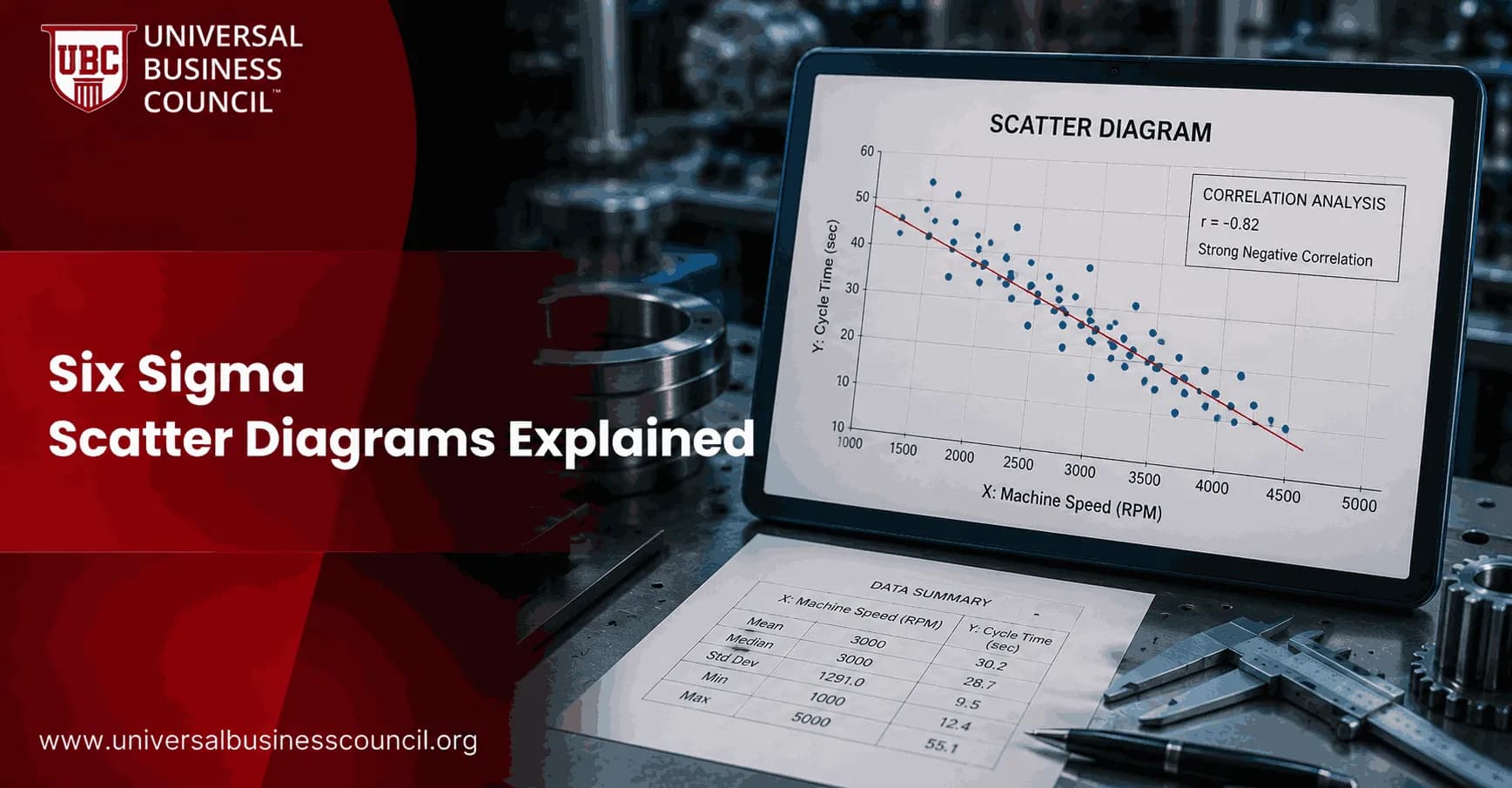
Six Sigma scatter diagrams help you see whether two process variables move together before you spend time on regression, experiments, or process changes. They are simple: plot paired data, look at the pattern, then decide whether the suspected cause deserves deeper analysis. Professionals building this discipline often start with a focused credential like the Certified Six Sigma Expert program, since knowing when a scatter plot is enough and when you need regression is a judgment skill DMAIC training builds directly.
That simplicity is the point. In DMAIC work, a scatter diagram is often the first honest test of a team's favorite theory. I have watched teams argue for weeks about staffing, machine speed, or supplier quality, then go quiet when the scatter plot shows no visible relationship. Good. That is what data is supposed to do.

What Is a Six Sigma Scatter Diagram?
A scatter diagram, also called a scatter plot, is a graph that plots two numerical variables on an x-y plane. The suspected input or cause goes on the horizontal x axis. The output, effect, or critical-to-quality measure goes on the vertical y axis.
Each dot represents one paired observation. If you are studying whether oven temperature affects defect rate, each point might show one production batch: temperature on the x axis, defect rate on the y axis.
Common Scatter Diagram Patterns
Positive correlation: As x increases, y tends to increase. The dots slope upward from left to right.
Negative correlation: As x increases, y tends to decrease. The dots slope downward.
Little or no correlation: The dots appear scattered without a clear line, curve, or cluster.
Nonlinear relationship: The dots follow a curve, which means a straight-line model may miss the real behavior.
The tighter the dots sit around a trend line, the stronger the visible relationship. A loose cloud may still matter, but treat it carefully and verify it with correlation or regression. Getting a team to actually accept a scatter plot's verdict, even when it contradicts a favorite theory, is a leadership and facilitation challenge, which is why process leads often pair Six Sigma training with broader Management Certifications, covering the facilitation skills needed to keep a data-driven conversation from sliding back into opinion.
Why Scatter Diagrams Matter in Six Sigma
Scatter diagrams are one of the seven basic quality tools, a set widely used in Lean Six Sigma, quality management, healthcare improvement, and operations analysis. You will usually use them in the Analyze phase of DMAIC, after you have measured the process and identified likely x variables.
The practical question is direct: Does this suspected input appear related to the outcome we care about?
That makes scatter diagrams useful for:
Testing root-cause hypotheses from a fishbone diagram or 5 Whys session.
Screening candidate x variables before building a regression model.
Finding outliers that may point to special cause variation.
Spotting subgroups, such as different shifts, machines, locations, or customer segments.
Communicating data patterns to leaders who do not want a statistics lecture.
To be blunt, a scatter plot will not prove causation. It shows association. That distinction trips up many certification candidates and, frankly, plenty of project teams. If the plot suggests a relationship, your next step is statistical testing, process knowledge, or a controlled experiment.
How to Create a Scatter Diagram
You can build a scatter diagram in Excel, Minitab, Google Sheets, R, Python, or most business intelligence tools. The mechanics are easy. The thinking before the chart matters more.
Define the question. Write the suspected cause and the outcome in plain language.
Collect paired data. Each x value must match the correct y value from the same unit, batch, customer, ticket, patient, or time period.
Use enough observations. Many Six Sigma training sources recommend at least 30 paired data points for a useful first look.
Put the suspected driver on the x axis. Put the result or quality characteristic on the y axis.
Label the chart clearly. Include variable names, units, date range, data source, and sample size.
Add a trend line if helpful. Use it to summarize direction, not to force meaning onto weak data.
Look for outliers and clusters. Do not delete odd points unless you can prove a data error.
A common first-timer mistake is mixing units. Plotting weekly staffing levels against daily complaint counts creates noise because the time periods do not match. Pair the data correctly or the chart will mislead you. When that mismatch comes from pulling x and y values out of two systems that were never designed to line up on the same timestamp, a Deep Tech Certification from Blockchain Council can help teams understand how integrated, well-synchronized data systems prevent that kind of pairing error, since a scatter plot is only as honest as the alignment of its two data sources.
How to Interpret the Results
Positive Correlation
If higher machine speed is associated with more defects, the plot may show a visible upward pattern. That is your signal to quantify the relationship rather than argue about it.
Negative Correlation
A negative relationship can be just as useful. In service operations, higher first-contact resolution may be associated with fewer repeat contacts. In manufacturing, more preventive maintenance hours may be associated with fewer breakdowns.
No Clear Correlation
No pattern is still a result. It tells you not to overinvest in that variable yet. Before dropping it, though, check whether you need to stratify the data. One machine, supplier, product family, or customer segment may be hiding inside the overall cloud.
Outliers and Subgroups
One point far from the others deserves attention. It could be a recording error. It could also be the only weekend shift, the only new supplier lot, or the one customer type your process handles badly. Do not average it away too soon.
Scatter Diagrams Versus Correlation and Regression
A scatter diagram is the visual starting point. Correlation gives you a numerical measure of relationship strength and direction. Regression estimates the size of the effect, such as how much defect rate changes for each one-degree increase in temperature.
Use this order in serious Six Sigma work:
Plot the scatter diagram.
Check for outliers, clusters, and nonlinearity.
Calculate correlation if the pattern looks roughly linear.
Run regression when you need an equation, prediction, or confidence interval.
Validate with process knowledge or experiment before changing controls.
If safety, regulatory compliance, patient outcomes, or major cost decisions are involved, do not stop at the picture. Visual evidence is useful, but it is not enough.
Where Scatter Diagrams Are Used
Scatter diagrams fit many environments:
Manufacturing: Temperature versus yield, machine speed versus defects, component dimension versus rework.
Healthcare: Process time versus patient wait time, staffing ratio versus incident rate, handoff delay versus discharge performance.
Service operations: Workload versus backlog, response time versus satisfaction, training hours versus error rates.
Technology teams: Deployment frequency versus incident volume, page load time versus conversion rate, ticket age versus escalation rate.
The tools make this easy. Excel can create a scatter plot in a few clicks. Minitab is common in Lean Six Sigma training because it adds fitted lines, regression output, and residual checks without much setup.
Best Practices for Six Sigma Scatter Diagrams
Start with a clear hypothesis, not random charting.
Use paired numerical data only.
Keep axis scales readable, with sensible intervals.
Stratify when you suspect different process conditions.
Never claim causation from the scatter plot alone.
Document the data source and sampling period in the project file.
If you are building Six Sigma capability, scatter diagrams should sit next to control charts, histograms, Pareto charts, and cause-and-effect diagrams in your working toolkit. Universal Business Council learners can connect this topic with related Six Sigma, quality management, and data analysis certification courses as they prepare for project-based improvement roles.
Next Step: Use the Plot Before the Model
The next time your team claims that one factor is driving defects, delays, churn, or cost, ask for a scatter diagram first. Collect at least 30 paired observations, plot the suspected x against the outcome y, and look for the pattern. If the relationship is visible, move to correlation or regression. If it is not, you have saved your project from chasing the wrong cause. If pairing that data keeps failing because your source systems will not share a common timestamp or ID, a Tech Certification from Global Tech Council is worth adding to your plan, since some data-pairing problems need better systems integration, not another chart.
FAQs
1. What is a scatter diagram in Six Sigma?
A Six Sigma scatter diagram, also called a scatter plot, is a graphical tool used to examine whether two quantitative variables appear to be related. Each observation is plotted as a point using an X-variable and a Y-variable.
For example, a team might plot:
Machine Temperature (X) → Defect Rate (Y)
If the points form a recognizable pattern, the variables may have a relationship worth investigating. Scatter diagrams are particularly useful during root cause analysis because they turn columns of numbers into something humans can inspect without developing an intimate relationship with a spreadsheet.
2. Why are scatter diagrams used in Six Sigma?
Scatter diagrams help teams investigate whether changes in one variable are associated with changes in another.
Common Six Sigma questions include:
Does temperature affect defect rate?
Does machine speed influence cycle time?
Does training time relate to productivity?
Does pressure affect product strength?
Does queue length influence customer waiting time?
A scatter plot provides an initial visual assessment before more formal statistical methods such as correlation or regression analysis are applied.
3. When are scatter diagrams used in DMAIC?
Scatter diagrams are particularly useful during the Analyze phase of DMAIC:
Define → Measure → Analyze → Improve → Control
During Analyze, teams investigate potential relationships between process inputs (Xs) and outputs (Ys).
They may also use scatter plots during Measure to explore baseline data and during Improve to evaluate relationships under changed operating conditions.
The underlying Six Sigma idea is often expressed as:
Y = f(X)
meaning process outputs are influenced by process inputs.
4. How do you create a Six Sigma scatter diagram?
A scatter diagram can be created using a straightforward process:
Step 1: Select two quantitative variables.
Step 2: Collect paired observations.
Step 3: Place the potential explanatory variable on the X-axis.
Step 4: Place the response variable on the Y-axis.
Step 5: Plot each paired observation as one point.
Step 6: Examine the overall pattern.
Step 7: Investigate unusual observations.
Step 8: Calculate correlation or fit a regression model when appropriate.
The data must be meaningfully paired. Randomly matching Tuesday's temperatures with Thursday's defect rates because the columns happen to have equal lengths is not statistical analysis.
5. What does a positive relationship look like on a scatter plot?
A positive relationship occurs when higher values of X tend to be associated with higher values of Y.
For example:
Machine Speed ↑ → Defect Rate ↑
The points generally move from the lower-left toward the upper-right of the graph.
The tighter the points cluster around an increasing pattern, the stronger the apparent positive relationship may be.
However, a positive relationship does not automatically prove that increasing X causes Y to increase.
6. What does a negative relationship look like on a scatter diagram?
A negative relationship occurs when higher values of one variable tend to be associated with lower values of another.
For example:
Preventive Maintenance Hours ↑ → Equipment Downtime ↓
The points generally move from the upper-left toward the lower-right.
This pattern suggests an inverse association.
Teams can use correlation and regression to quantify the relationship and determine whether other variables need to be considered.
7. What does no correlation look like on a scatter plot?
When two variables have little apparent relationship, the points may appear widely scattered without a clear upward or downward pattern.
For example:
Employee Shoe Size → Machine Defect Rate
would presumably produce little meaningful association, barring an extremely strange manufacturing process.
A correlation coefficient near zero can indicate little linear relationship, but teams should still inspect the graph because strong nonlinear relationships can sometimes have weak linear correlation.
8. What is the difference between a scatter diagram and correlation?
A scatter diagram visually displays the relationship between two variables.
Correlation provides a numerical measure of the strength and direction of a linear association.
The Pearson correlation coefficient is commonly represented by r and ranges from:
−1 to +1
Where:
r near +1 → strong positive linear association
r near −1 → strong negative linear association
r near 0 → weak linear association
The scatter plot shows the pattern. Correlation summarizes one aspect of that pattern numerically.
9. What is a strong correlation in Six Sigma?
There is no universal threshold defining a “strong” correlation because interpretation depends on the process, data quality, sample size, and business context.
As rough descriptive guidance, practitioners sometimes interpret absolute correlation values as:
Near 0 → weak linear association
Moderate absolute values → moderate association
Near 1 → strong linear association
However, a correlation of 0.5 could be operationally important in one process and largely useless in another.
Six Sigma teams should evaluate process significance, not merely hunt for an impressive-looking coefficient.
10. Does correlation prove causation in Six Sigma?
No.
This is one of the most important rules when interpreting scatter diagrams:
Correlation ≠ Causation
Two variables can move together because:
X causes Y
Y causes X
A third variable affects both
Data collection creates the pattern
The association occurs by chance
For example, high machine temperature and high defects might both result from increased production speed.
A scatter diagram identifies a relationship worth investigating. It does not award root-cause status.
11. How can scatter diagrams help with root cause analysis?
Scatter diagrams allow Six Sigma teams to test suspected relationships generated through tools such as:
Fishbone diagrams
5 Whys
Process maps
FMEA
Brainstorming
Pareto analysis
Suppose a Fishbone analysis identifies temperature as a potential cause of defects.
The team can collect paired observations:
Temperature | Defect Rate |
|---|---|
180°C | 1.2% |
190°C | 1.8% |
200°C | 3.0% |
210°C | 4.4% |
220°C | 6.1% |
A scatter plot may reveal a strong positive relationship worth testing more formally.
This moves root cause analysis from “we think” toward “the data suggests.”
12. What are outliers in a scatter diagram?
An outlier is an observation that appears substantially different from the overall pattern.
Suppose most observations follow:
Temperature ↑ → Defects ↑
but one high-temperature observation has almost no defects.
That point should be investigated rather than automatically deleted.
Possible explanations include:
Data-entry errors
Measurement errors
Different operating conditions
Special causes
Different materials
Process changes
Outliers can be mistakes, but they can also contain the most useful information in the dataset. Deleting them because they make the graph untidy is statistics by interior design.
13. Can a scatter plot show nonlinear relationships?
Yes.
Not every process relationship is a straight line.
Scatter diagrams may reveal patterns such as:
Curved relationship: Y increases faster as X increases.
U-shaped relationship: Both very low and very high X values produce poor outcomes.
Threshold effect: Y changes significantly only after X reaches a certain point.
Plateau: Y improves with X initially but eventually stops improving.
These patterns may require nonlinear regression, transformations, or other statistical techniques rather than simple Pearson correlation.
14. What is the difference between a scatter plot and a run chart?
A scatter plot examines the relationship between two quantitative variables.
A run chart examines how one variable changes over time.
For example:
Scatter Plot: Temperature vs Defect Rate
Run Chart: Defect Rate vs Date
A run chart is useful for detecting trends and shifts over time, while a scatter diagram is useful for investigating potential relationships between variables.
Choosing the correct chart depends on the question being asked, an apparently radical concept in dashboard design.
15. What is the difference between a scatter diagram and a control chart?
A scatter diagram explores relationships between two variables.
A control chart monitors process behavior over time and helps distinguish common-cause variation from special-cause variation.
For example:
Scatter Diagram: Pressure vs Product Strength
Control Chart: Product Strength over successive production samples
Scatter diagrams are primarily exploratory and relational. Control charts are primarily used for process stability and monitoring.
Both can be useful within the same Six Sigma project.
16. How is regression analysis related to scatter diagrams?
Regression analysis mathematically models the relationship between a response variable and one or more explanatory variables.
For a simple linear relationship:
Y = a + bX
Where:
Y = predicted response
X = explanatory variable
a = intercept
b = slope
A scatter plot helps determine whether a linear model appears reasonable before or alongside regression analysis.
Regression can then quantify how much Y is expected to change when X changes.
17. What does R-squared mean on a Six Sigma scatter plot?
R-squared (R²) describes the proportion of observed variation in the response variable explained by a regression model, under that model's assumptions.
For example:
R² = 0.70
means the fitted model explains approximately 70% of the observed variation in Y within the analyzed dataset.
A high R² does not automatically prove causation or guarantee a good model. Teams should also examine residuals, model assumptions, influential observations, practical significance, and whether important variables are missing.
One impressive statistic cannot carry an entire analysis indefinitely.
18. What mistakes should be avoided when using scatter diagrams?
Common mistakes include:
Assuming correlation proves causation.
Using too little data.
Pairing observations incorrectly.
Ignoring outliers.
Using only correlation and ignoring nonlinear patterns.
Mixing different process populations together.
Ignoring time effects.
Restricting the range of X values too heavily.
Drawing conclusions from visual appearance alone.
Scatter plots are excellent exploratory tools, but important decisions should be supported with appropriate statistical and process evidence.
19. What is a practical Six Sigma scatter diagram example?
Suppose a call center suspects that agent workload affects customer waiting time.
The team collects:
Calls per Agent | Average Wait Time |
|---|---|
20 | 1.5 min |
25 | 1.9 min |
30 | 2.6 min |
35 | 3.4 min |
40 | 4.7 min |
45 | 6.2 min |
A scatter diagram would likely show:
Calls per Agent ↑ → Waiting Time ↑
The team could then use regression and additional operational analysis to determine how workload influences waiting time and whether staffing changes would improve performance.
The scatter diagram identifies the relationship. It does not, by itself, determine the staffing policy.
20. How should Six Sigma teams interpret scatter diagrams correctly?
A useful interpretation process is:
Define X and Y
↓
Collect reliable paired data
↓
Plot the observations
↓
Look for direction
↓
Evaluate strength
↓
Check for outliers
↓
Look for nonlinear patterns
↓
Stratify by relevant factors
↓
Calculate correlation if appropriate
↓
Use regression or statistical testing
↓
Investigate causal mechanisms
↓
Validate the suspected relationship
The central Six Sigma principle is:
Y = f(X)
If teams want to improve an output Y, they need to understand which process inputs X meaningfully influence it.
Scatter diagrams provide a fast way to begin that investigation.
They are especially powerful when combined with process knowledge, Measurement System Analysis, correlation, regression, hypothesis testing, and designed experiments.
The important word, however, is relationship. A scatter diagram can show that two variables move together. It cannot independently prove why.
So when a beautifully diagonal cloud of dots appears on the screen, resist the ancient corporate instinct to declare the root cause discovered and schedule the victory presentation. The graph has given you evidence. The investigation still has work to do.
Related Articles
View AllSix Sigma
Six Sigma Correlation Explained: Measuring Relationships Between Variables
Learn how Six Sigma correlation measures relationships between X and Y variables using scatter plots, Pearson r, p-values, and regression.

Six Sigma
Six Sigma Cost of Poor Quality: Finding Hidden Losses
Six Sigma Cost of Poor Quality explains how defects, rework, downtime, and lost customers hide real financial losses inside everyday operations.

Six Sigma
Six Sigma Minitab Explained: Statistical Software for DMAIC Projects
Learn how Six Sigma Minitab supports DMAIC projects with capability analysis, control charts, DOE, regression, Minitab Engage, and real project results.
Trending Articles
The Role of Blockchain in Ethical AI Development
How blockchain technology is being used to promote transparency and accountability in artificial intelligence systems.
AWS Career Roadmap
A step-by-step guide to building a successful career in Amazon Web Services cloud computing.
Top 5 DeFi Platforms
Explore the leading decentralized finance platforms and what makes each one unique in the evolving DeFi landscape.