

HR Analytics Dashboards: Key Metrics Every HR Expert Should Track
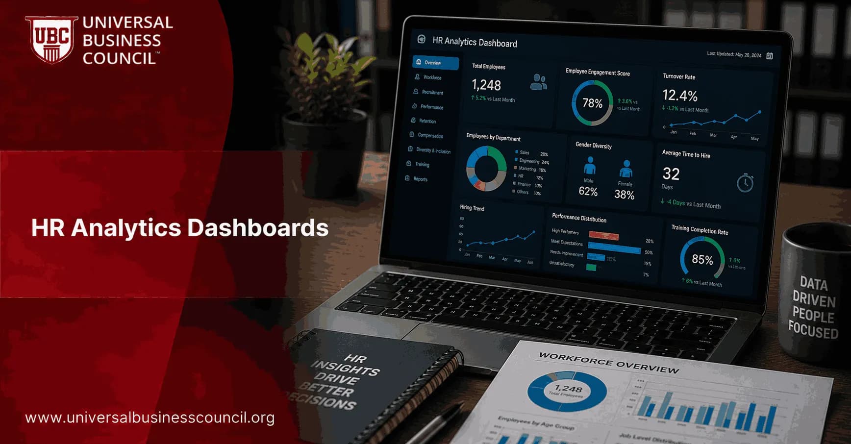
HR analytics dashboards should show whether your workforce is healthy, productive, and aligned with business priorities. Not just whether HR is busy. The best dashboards give HR leaders and line managers one clear view of hiring speed, turnover risk, workforce cost, engagement, learning impact, and employee relations pressure.
That shift matters. Recent human capital research points to a move toward work systems where people and technology share decisions, with analytics supporting faster workforce calls rather than simple cost cutting. The practical value of an HR dashboard is the same: connect recruitment, performance, absence, training, and engagement data into a single story that someone can act on. For HR experts, the skill is no longer producing reports. It is choosing the metrics that change decisions.

As workforce decisions become increasingly strategic, the role of an HR Professional continues to evolve from administrative reporting to guiding business leaders with data-backed workforce insights and planning.
What an HR Analytics Dashboard Should Actually Do
A useful dashboard answers a business question. Are we losing critical talent? Is hiring slowing the revenue teams? Are wellbeing issues showing up before resignations? Is learning spend producing internal movement?
A weak dashboard lists activity. Interviews completed. Courses launched. Survey responses collected. Those numbers may help operational teams, but leadership asks a harder question: so what?
To be blunt, if a dashboard cannot trigger an action, retire that metric or move it to a secondary view. The executive version should focus on outcomes, trends, and risk. The HR operations version can hold the deeper workflow detail.
Workforce Composition and Cost Metrics
Start with the basics, because every workforce decision depends on them. Your first dashboard layer should show who works in the organization, where they sit, and what the workforce costs.
Headcount: total employees by function, location, grade, contract type, and manager.
Full-time equivalent count: a better capacity measure than raw headcount when part-time roles are common.
Total workforce cost: compensation, benefits, contractors, and other employment costs.
HR cost per FTE: HR operating cost divided by total FTE.
Diversity indicators: representation by gender, age, ethnicity, disability status, or other legally and locally appropriate categories.
Do not present diversity metrics as decoration. Segment them by hiring, promotion, turnover, and leadership level. Representation without movement data hides the real story.
Talent Acquisition Metrics
Recruitment dashboards are often the first ones an organization builds, because hiring bottlenecks are visible and expensive. Keep the view tight.
Time to hire: average days from candidate application to accepted offer.
Time to fill: days from requisition approval to candidate start date.
Cost per hire: total recruiting cost divided by number of hires.
Offer acceptance rate: accepted offers divided by total offers extended.
Pipeline conversion: movement from sourcing to screening, interview, offer, and hire.
Quality of hire: early performance, first-year retention, hiring manager feedback, or a combined score.
Here is the detail that often catches teams out. A strong top of funnel can still produce poor hiring. If screening to interview is 70 percent but interview to offer is 8 percent, the problem is probably role calibration, interviewer alignment, or unrealistic requirements. Buying more job ads will just burn budget faster.
Track source quality too. A channel with cheap applicants can be costly if candidates drop out after the first interview or reject offers because the role was poorly positioned.
Talent Retention and Internal Mobility Metrics
Turnover is not one number. Overall turnover may look stable while a critical engineering group, a sales region, or the frontline supervisor layer is leaking talent.
Turnover rate: separations during period / average headcount x 100.
Voluntary turnover: resignations as a percentage of average headcount.
Involuntary turnover: employer-initiated separations as a percentage of average headcount.
Retention rate: employees remaining from period start / employees at period start x 100.
Internal mobility rate: percentage of open roles filled by internal candidates.
Average tenure: tenure by role, level, business unit, and manager group.
Internal mobility deserves more attention than it gets. A low internal hire ratio can signal poor career pathways, weak manager support, or job architecture that blocks movement. It also raises external recruitment cost. For many organizations, a mobility dashboard is where learning, succession, and retention finally connect.
Employee Experience, Engagement, and Wellbeing Metrics
Engagement scores are useful, but only when paired with behavior and outcome data. A quarterly survey score on its own is too easy to admire and too hard to act on.
Engagement index: usually an average across validated survey questions.
Employee satisfaction or climate score: perceptions of leadership, workload, trust, and support.
Employee Net Promoter Score: promoters minus detractors based on the question: would you recommend this company as a place to work?
Absenteeism rate: total absence days / total scheduled workdays x 100.
Wellbeing participation: use of wellbeing programmes, employee assistance programmes, and health-related benefits.
Wellbeing is becoming part of organizational infrastructure, not a side programme. That view is practical. Rising absence, low survey energy, and high overtime in the same team are not soft signals. They are early warnings.
Performance and Productivity Metrics
Performance dashboards should link people data to business outcomes. Avoid building a dashboard that only shows who completed reviews on time.
Performance rating distribution: percentage of employees in each rating band.
High performer ratio: proportion of employees rated as high performing or high potential.
Goal or OKR attainment: progress against objectives by team or function.
Productivity per FTE: revenue, output, cases resolved, or value delivered per employee.
Post-intervention improvement: performance movement after coaching, training, or manager action.
Be careful with productivity per FTE. It works well in some contexts, such as revenue teams or service operations, but it can mislead in functions where quality, risk control, or innovation matter more than volume. Pair it with a second metric that captures quality.
Learning, Development, and Career Growth Metrics
Learning dashboards should answer whether people are gaining skills the business needs. Completion rates alone do not prove value.
Training spend per employee: total learning investment divided by headcount.
Training hours per employee: average learning hours by group.
Mandatory completion rate: compliance training completion by deadline.
Skill proficiency: assessment results or manager-validated skill inventory data.
Internal promotion rate: roles filled through promotion rather than external hiring.
Succession coverage: percentage of critical roles with ready-now or ready-soon successors.
Professionals who understand both metric design and workforce strategy are better placed to explain why a learning investment should continue, change, or stop. That combination of technical and strategic judgment is exactly what structured HR, management, and business analytics training builds.
These capabilities are increasingly associated with an HR Analytics Expert, who combines workforce data, business context, and analytical thinking to support smarter talent, learning, and organizational decisions.
Employee Relations, Compliance, and Risk Metrics
Employee relations dashboards are becoming standard because regulatory change, AI use, and workplace conflict create real risk. Leaders increasingly want visibility into case volumes, resolution times, and the employee relations workload itself.
Cases opened and closed: volume by period and business unit.
Average time to resolution: days to close grievances, investigations, or disputes.
Backlog: open cases by age and severity.
Issue type: harassment, discrimination, policy violation, performance, conduct, or manager behavior.
Corrective actions: action taken, follow-up status, and repeat issue rate.
Do not let this dashboard become a blame tool. Its purpose is pattern detection and risk management. If one location has repeated policy complaints and slow case closure, the right move may be manager training, ER staffing, process redesign, or legal review.
How to Design HR Analytics Dashboards That Leaders Use
Good dashboards are designed backward from decisions. Before building another chart, ask what the viewer needs to do differently after seeing it.
Start with business questions. Are we retaining critical talent? Which hiring stage is slowing growth? Where is employee relations risk rising?
Choose outcome metrics first. Put retention, quality of hire, productivity, succession coverage, and risk indicators ahead of activity counts.
Segment the data. Break metrics down by function, role, level, location, manager, and legally appropriate demographic group.
Show trends, not snapshots. Month-over-month and year-over-year views reveal whether action is working.
Pair leading and lagging indicators. Combine engagement, absence, workload, and wellbeing signals with turnover and performance outcomes.
Add definitions. A dashboard without metric definitions turns every meeting into a calculation dispute.
Protect privacy. Use role-based access, aggregation thresholds, anonymization, and audit trails, especially when AI-generated insights are involved.
As HR teams work with modern analytics platforms and AI-enabled tools, a Tech Certification can help professionals strengthen their understanding of emerging technologies, automation, and digital workforce management.
The Future: Predictive, Skills-Based, and Governed
HR analytics dashboards are moving from static reporting to decision support. Expect more AI-generated attrition risk signals, skill gap forecasts, scenario planning, and workforce capacity views. That does not mean HR should automate judgment. It means HR must get better at asking the right questions and challenging the output.
Skills-based analytics will grow too. Instead of viewing talent only by job title, dashboards will track skill supply, demand, proficiency, and readiness. That matters most for workforce planning, succession, and internal mobility.
The trade-off is governance. The more predictive a dashboard becomes, the more HR has to explain the data source, calculation logic, fairness checks, and privacy controls. Trust is part of the system.
Next Step for HR Professionals
If you are building or improving HR analytics dashboards, start with seven views: workforce cost, hiring, retention, engagement, performance, learning, and employee relations. Pick three metrics in each view, define them clearly, and review trends by segment over the last 12 months.
Then tie your development plan to formal learning. Explore Universal Business Council certification pathways and related courses in HR, management, and analytics to build both the technical dashboard skills and the strategic judgment needed to use them well.
Professionals preparing for the next generation of HR can also benefit from a Deeptech Certification to build a broader understanding of AI, automation, and other advanced technologies that are reshaping workforce analytics and strategic decision-making.
FAQs
1. What Is an HR Analytics Dashboard?
An HR analytics dashboard is a visual reporting tool that displays key workforce metrics in one place. It helps HR professionals monitor hiring, employee performance, retention, engagement, and workforce trends to support data-driven decisions.
2. Why Are HR Analytics Dashboards Important?
HR dashboards provide real-time insights into workforce performance, helping HR teams identify trends, measure HR initiatives, improve decision-making, and align people strategies with business objectives.
3. What Metrics Should Every HR Analytics Dashboard Include?
A comprehensive dashboard should track employee headcount, turnover rate, retention rate, time-to-hire, cost-per-hire, absenteeism, employee engagement, productivity, diversity, and training metrics.
4. How Does an HR Dashboard Improve Workforce Planning?
HR dashboards help identify workforce gaps, hiring needs, skill shortages, and employee trends, allowing organizations to plan staffing requirements more accurately.
5. What Is Employee Turnover Rate and Why Should It Be Tracked?
Employee turnover rate measures the percentage of employees leaving an organization during a specific period. Tracking it helps HR identify retention challenges and improve workforce stability.
6. Why Is Employee Retention Rate an Important HR Metric?
Retention rate measures how well an organization keeps its employees over time. A strong retention rate often indicates positive workplace culture, employee satisfaction, and effective HR practices.
7. What Is Time-to-Hire and Why Does It Matter?
Time-to-hire measures the number of days required to fill a vacant position. Monitoring this metric helps HR improve recruitment efficiency and reduce hiring delays.
8. How Does Cost-per-Hire Help HR Teams?
Cost-per-hire calculates the total recruitment cost for each new employee, including advertising, interviews, onboarding, and agency fees, helping organizations optimize hiring budgets.
9. Why Should HR Track Employee Engagement?
Employee engagement reflects how committed and motivated employees are. Tracking engagement helps HR identify workplace issues, improve morale, and increase productivity.
10. What Is Absenteeism Rate in HR Analytics?
Absenteeism rate measures how often employees are absent from work. High absenteeism may indicate workplace stress, low engagement, health concerns, or management challenges.
11. How Can HR Dashboards Measure Employee Performance?
Dashboards can track performance review scores, goal completion, productivity indicators, promotion rates, and development progress to support performance management decisions.
12. Why Is Diversity and Inclusion Data Important?
Tracking workforce diversity helps organizations measure representation, monitor hiring fairness, support inclusion initiatives, and build a more equitable workplace.
13. How Can HR Dashboards Support Learning and Development?
HR dashboards monitor training participation, certification completion, skill development, learning progress, and training effectiveness to evaluate employee growth programs.
14. What Role Does Predictive Analytics Play in HR Dashboards?
Predictive analytics uses workforce data to forecast hiring demand, employee turnover, staffing needs, and future workforce trends, enabling proactive HR planning.
15. Which Tools Are Commonly Used to Build HR Analytics Dashboards?
Popular tools include Microsoft Power BI, Tableau, Google Looker Studio, Microsoft Excel, SAP SuccessFactors, Workday, Oracle HCM, BambooHR, and other HR analytics platforms.
16. How Can HR Dashboards Improve Executive Decision-Making?
Dashboards present workforce data in a clear, visual format, allowing executives to quickly understand HR performance, identify trends, and make informed strategic decisions.
17. What Challenges Do Organizations Face When Creating HR Dashboards?
Common challenges include inconsistent data, disconnected HR systems, poor data quality, privacy concerns, selecting the wrong KPIs, and ensuring dashboards remain up to date.
18. How Often Should HR Analytics Dashboards Be Updated?
Most organizations update HR dashboards weekly or monthly, while critical metrics such as recruitment pipelines, attendance, and workforce capacity may be monitored daily for timely decision-making.
19. What Common Mistakes Should HR Professionals Avoid When Building Dashboards?
Avoid tracking too many metrics, using inaccurate or outdated data, ignoring business goals, creating overly complex dashboards, and presenting numbers without meaningful insights. A useful dashboard answers business questions rather than simply displaying data.
20. How Can HR Analytics Dashboards Improve Business Performance?
HR analytics dashboards help organizations make faster, evidence-based decisions by monitoring workforce health, improving recruitment, increasing employee retention, enhancing productivity, and supporting long-term workforce planning. By turning HR data into actionable insights, dashboards enable HR teams to contribute more strategically to overall business growth and organizational success.
Related Articles
View All
Hr
From HR Generalist to HR Analytics Expert: Career Path, Skills, and Certifications
A practical guide for moving from HR generalist to HR analytics expert, including skills, tools, career stages, use cases, and certification planning.

Hr
Essential HR Analytics Skills Every Modern HR Professional Needs to Master
Learn the essential HR analytics skills modern HR professionals need, from data literacy and statistics to AI, ethics, storytelling, and workforce planning.

Hr
How HR Analytics Supports Strategic Talent Management and Succession Planning
Learn how HR analytics strengthens strategic talent management, improves succession planning, reduces leadership risk, and supports fairer workforce decisions.
Trending Articles
The Role of Blockchain in Ethical AI Development
How blockchain technology is being used to promote transparency and accountability in artificial intelligence systems.
AWS Career Roadmap
A step-by-step guide to building a successful career in Amazon Web Services cloud computing.
Top 5 DeFi Platforms
Explore the leading decentralized finance platforms and what makes each one unique in the evolving DeFi landscape.