

Six Sigma Excel Tools: Templates, Charts, and Analysis Techniques
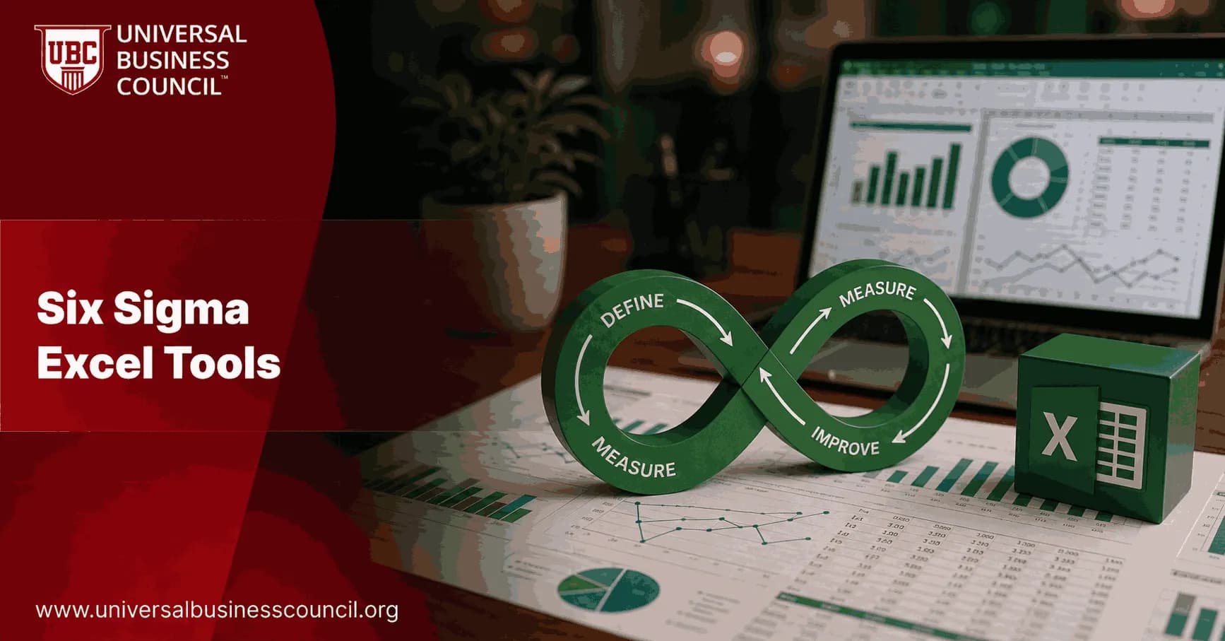
Six Sigma Excel tools have become the working language of many improvement teams because Excel is already on the desktop, understood by managers, and flexible enough for DMAIC analysis. You can build a SIPOC, calculate Cpk, create a Pareto chart, test a hypothesis, and publish a dashboard without buying a separate statistics package. Professionals who want to run this kind of analysis with real statistical grounding, rather than just clicking through templates, often start with the Certified Six Sigma Expert credential, which covers the DMAIC discipline this article is built around.
That does not mean Excel is perfect. It is easy to overwrite a formula or chart the wrong range. Still, for Green Belt-level projects and many operational improvement efforts, a well-controlled Excel workbook is often the fastest route from raw data to a decision.

Why Six Sigma Excel Tools Still Matter
Specialist tools such as Minitab and JMP are excellent for deeper statistical work. But most teams do not start there. They start with exported data from Salesforce, SAP, ServiceNow, Google Analytics 4, or a production system. That data usually lands in Excel. Because rolling out consistent Excel practice across a team touches training, governance, and workflow standards at once, quality leaders often pair this work with broader Management Certifications, since driving that kind of standardization across a team is a leadership skill in its own right.
The strength of Six Sigma Excel tools is practical reach. Microsoft documents functions such as AVERAGE, STDEV.S, T.TEST, and the Data Analysis ToolPak, and these cover a large share of everyday Six Sigma analysis. Add pivot tables, slicers, conditional formatting, and Power Query, and Excel becomes a credible environment for project scoping, measurement, analysis, and control.
To be blunt, Excel is the wrong choice when you need advanced designed experiments, complex non-normal capability models, or strict audit trails. For defect prioritization, trend monitoring, basic regression, gage studies, and capability snapshots, it is usually enough.
Core Six Sigma Excel Templates for DMAIC Work
Project and process templates
Good Six Sigma work starts before the first chart. Use templates that force clarity on the problem, the process, and the customer requirement.
Project charter: Define the business problem, scope, goal, timeline, sponsor, and expected benefit.
SIPOC: Map suppliers, inputs, process steps, outputs, and customers before collecting data.
Stakeholder analysis: Identify who can block the project and who must approve the control plan.
FMEA: Score severity, occurrence, and detection to prioritize process risks.
Control plan: Specify the metric, owner, review frequency, reaction plan, and evidence required.
A common mistake is building the dashboard first. Do not. If the charter and SIPOC are vague, your dashboard will only make confusion look organized.
Measurement system analysis templates
Before you trust a defect count or cycle-time measure, check the measurement system. Excel templates can support Type I gage studies, gage R&R for continuous data, and attribute agreement analysis for pass or fail decisions. AIAG measurement system guidance is widely used in manufacturing, and many Excel templates mirror its repeatability and reproducibility calculations.
Here is the trap: teams often run capability analysis on data collected by different operators using different definitions. In one service operation review, the first data pull showed a 14 percent rework rate. After the team standardized the rework definition, the measured rate dropped to 9 percent. The process had not improved yet. The measurement system had.
Charts Every Six Sigma Practitioner Should Build in Excel
Pareto charts
Pareto charts rank defects, delays, or complaints by frequency or cost. In Excel, use a sorted bar chart with a cumulative percentage line. This is the chart you want when leadership asks, Where should we focus first?
Do not use defect count alone if the impact differs sharply. Five billing errors that delay cash may matter more than fifty cosmetic form errors.
Histograms and box plots
Histograms show distribution shape. They help you see skew, multiple process streams, and outliers before you calculate capability. Excel supports histograms through built-in charting, and newer versions include box-and-whisker plots for comparing teams, shifts, suppliers, or regions.
If your histogram is heavily skewed, be careful with normal-based Cp and Cpk. The formula may run, but the conclusion can be wrong.
Control charts and run charts
Excel can build X-bar and R charts, ImR charts, p charts, and simple run charts. A basic control chart needs:
A time-ordered data series.
A center line, usually the mean.
Upper and lower control limits.
A visual check for special cause signals.
Control charts are not just prettier line charts. Their job is to separate common cause variation from special cause variation. If you react to every up and down movement, you will create more noise than improvement.
Analysis Techniques Supported by Excel
Capability analysis
Six Sigma Excel tools commonly calculate Cp, Cpk, Pp, Ppk, PPM, and sigma level. For a stable, approximately normal process, Cp compares process spread with specification width, while Cpk also accounts for centering.
A practical rule: do not celebrate a Cpk value until you have checked stability, measurement quality, and distribution shape. Cpk from a messy data set is just a precise-looking guess.
Hypothesis testing
Excel can run t tests, ANOVA, correlation, and regression through built-in functions and the Data Analysis ToolPak. Use these when you need to test whether a process change likely caused a measurable difference.
T.TEST: Compare two means, such as average cycle time before and after a change.
ANOVA: Compare more than two groups, such as three production lines.
Regression: Estimate how inputs such as temperature, staffing, or queue size relate to output.
Scatter plots: Check the relationship visually before trusting the regression table.
The p-value is not the business case. Pair statistical results with operational metrics such as cost of poor quality, first-pass yield, lead time, customer churn, or NPS.
Dashboards for the control phase
Recent Excel practice has moved beyond static worksheets. Pivot tables, slicers, conditional formatting, sparklines, and Power Query can turn a control plan into a usable operating dashboard. Keep it simple. The best control dashboard I have seen had six metrics, one owner per metric, and a red cell that triggered a same-day review. No decorative charts. It worked. As teams push these dashboards toward automated data feeds, Power Query pipelines, and connected systems, some analysts also pair this Excel work with a Deep Tech Certification to build a stronger footing in the emerging technology now feeding these live dashboards.
How to Choose the Right Six Sigma Excel Tool
Use this quick selection guide:
Define phase: Project charter, SIPOC, stakeholder map, voice of customer table.
Measure phase: Data collection plan, operational definition sheet, gage R&R template.
Analyze phase: Pareto chart, histogram, fishbone diagram, regression, hypothesis test.
Improve phase: FMEA, countermeasure matrix, pilot test tracker.
Control phase: Control chart, control plan, dashboard, audit checklist.
If you are preparing for a Six Sigma role, connect these tools to formal learning. Universal Business Council's Six Sigma training programmes give you a structured route through DMAIC, especially alongside related business analytics, project management, and operations courses.
Best Practices for Reliable Excel-Based Six Sigma Analysis
Lock formula cells and protect finished templates.
Keep raw data on a separate tab. Never edit the source extract directly.
Label units, dates, filters, and specification limits clearly.
Use named ranges for formulas that will be reused.
Document assumptions, especially normality, sample exclusions, and subgrouping rules.
Version-control important workbooks with date and owner fields.
Start with one live process metric this week. Export the data, build a Pareto chart, check the trend, and write one clear improvement question. If you can explain that chart to a process owner in two minutes, you are using Six Sigma Excel tools the right way. If your role also touches the systems exporting that raw data, such as ERP or ticketing platforms, a general Tech Certification can help round out that technical side of the work.
FAQs
1. How is Excel used in Six Sigma projects?
Microsoft Excel is commonly used in Six Sigma projects for collecting data, performing calculations, creating charts, tracking KPIs, and documenting DMAIC results. Teams can use Excel for descriptive statistics, Pareto analysis, histograms, basic control charts, process capability calculations, dashboards, and improvement tracking. Its accessibility makes it particularly useful for Green Belts and operational teams. However, advanced statistical analyses may require specialized software or validated add-ins, since spreadsheets are useful tools but remain perfectly capable of accepting terrible formulas without complaint.
2. What are the most useful Six Sigma Excel tools?
Useful Six Sigma Excel tools include PivotTables, charts, formulas, conditional formatting, descriptive statistics, the Analysis ToolPak, data validation, Power Query, and structured tables. These features can support defect analysis, process measurement, trend analysis, KPI reporting, and basic statistical investigation. Organizations may also use specialized Excel add-ins for advanced quality analysis. The best tools depend on the DMAIC phase, data type, process complexity, and level of statistical analysis required.
3. What are Six Sigma Excel templates?
Six Sigma Excel templates are preformatted spreadsheets designed to support common process improvement activities. Examples include DMAIC project trackers, SIPOC templates, Pareto analysis sheets, defect logs, process capability calculators, FMEA worksheets, control plans, root cause analysis templates, and project dashboards. Templates can save time and standardize reporting across improvement projects. They should still be reviewed and adapted to the specific process because a beautifully formatted template cannot rescue poorly defined data or an unclear improvement objective.
4. How can you create a Pareto chart in Excel for Six Sigma?
A Pareto chart helps Six Sigma teams prioritize problems by showing defect categories from highest to lowest frequency, usually alongside a cumulative percentage line. In Excel, teams can organize defect categories and frequencies, sort them in descending order, calculate cumulative percentages, and create an appropriate chart. Some Excel versions also include built-in Pareto chart functionality. The chart helps identify the relatively small number of defect categories that contribute most heavily to overall process problems.
5. How can you create a control chart in Excel?
A basic control chart in Excel can be created by organizing process measurements in time order and calculating the process center line and appropriate upper and lower control limits for the selected chart type. These values can then be plotted to monitor process behavior over time. The statistical formulas depend on the data and control-chart type. Teams should avoid simply placing arbitrary limits around a line chart, because specification limits and statistical control limits serve different purposes.
6. Can Excel be used for process capability analysis?
Yes. Excel can be used for basic process capability analysis by calculating process averages, standard deviations, and capability indices such as Cp and Cpk when the required assumptions are satisfied. Histograms and other charts can also help visualize the relationship between process output and specification limits. However, practitioners should first assess process stability, measurement reliability, distribution assumptions, and data quality. Specialized statistical software may be preferable for complex capability studies or processes involving non-normal data.
7. How do you calculate Cp and Cpk in Excel?
Cp and Cpk can be calculated in Excel using formulas based on the process mean, estimated standard deviation, Upper Specification Limit (USL), and Lower Specification Limit (LSL). Cp measures potential capability based on process spread, while Cpk also accounts for how centered the process is between specification limits. Excel makes the arithmetic straightforward, but interpretation requires statistical understanding. A calculated Cpk value is not automatically meaningful if the process is unstable or the underlying data is unreliable.
8. Can Excel calculate DPMO and Six Sigma level?
Excel can be used to calculate Defects Per Million Opportunities (DPMO) when the number of defects, units, and defect opportunities per unit are clearly defined. Teams can create formulas that standardize defect performance into a comparable metric. Excel can also support calculations used to estimate sigma performance levels, depending on the methodology and assumptions adopted. Organizations should document their calculation conventions because different sigma-level approaches can produce different interpretations of the same process data.
9. How can Excel be used for DMAIC projects?
Excel can support every DMAIC phase. During Define, teams can document project objectives, CTQs, and SIPOC information. During Measure, Excel can collect data and calculate baseline metrics. During Analyze, PivotTables, Pareto charts, scatter plots, and statistical functions can help investigate potential causes. During Improve, teams can compare pilot results and track action plans. During Control, dashboards, trend charts, and control charts can help monitor whether improved performance is sustained.
10. What Excel charts are useful for Six Sigma analysis?
Useful Excel charts for Six Sigma include Pareto charts, histograms, scatter plots, run charts, control charts, box-and-whisker plots, and column or bar charts. Each chart answers a different question. Histograms show distributions, scatter plots help explore relationships between variables, Pareto charts prioritize defect categories, and run or control charts examine process behavior over time. Choosing a chart based on the analytical question is considerably more useful than adding every available chart until the workbook resembles an aircraft cockpit.
11. How can PivotTables help with Six Sigma analysis?
PivotTables allow Six Sigma practitioners to summarize and segment large datasets without writing extensive formulas. For example, defect data can be grouped by product, machine, supplier, shift, location, defect category, or operator. This makes it easier to identify patterns and determine where problems are concentrated. PivotTables can also support dashboards and Pareto analysis. They are especially useful during the Measure and Analyze phases when teams need to explore operational data from multiple perspectives.
12. How is the Excel Analysis ToolPak used in Six Sigma?
The Excel Analysis ToolPak provides statistical functions that can support selected Six Sigma analyses, including descriptive statistics, regression, correlation, ANOVA, and certain hypothesis-testing procedures. These tools can help teams examine process variation and relationships between variables. However, practitioners need to understand the assumptions and limitations of each method before interpreting results. For more specialized quality techniques such as advanced control charts, Gage R&R, or complex DOE, dedicated statistical software may be more suitable.
13. Can Excel be used for root cause analysis in Six Sigma?
Yes. Excel can support root cause analysis by organizing defect data, creating Pareto charts, comparing process groups, analyzing trends, and exploring relationships between potential causes and outcomes. Teams can also build worksheets for the 5 Whys, fishbone analysis, and corrective-action tracking. Excel itself does not identify the root cause automatically. Its role is to organize and analyze evidence that helps practitioners test potential explanations rather than relying entirely on assumptions or opinions.
14. Can Excel be used for Measurement System Analysis and Gage R&R?
Excel can support Measurement System Analysis and Gage R&R calculations when appropriate formulas and study designs are used. Organizations may build validated templates or use specialized Excel add-ins for this purpose. However, Gage R&R involves more than entering measurements into a spreadsheet. Teams must select suitable parts, appraisers, repetitions, and analytical methods. Specialized statistical software is often easier and less error-prone for detailed measurement-system studies.
15. Can Excel be used for hypothesis testing in Six Sigma?
Yes. Excel can perform several statistical tests through built-in functions and the Analysis ToolPak. Depending on the data and question, practitioners may use t-tests, F-tests, ANOVA, regression, and related techniques. Hypothesis testing can help determine whether observed process differences are statistically meaningful. Users must still select the appropriate test, verify assumptions, and consider practical significance. A small p-value is not a ceremonial certificate proving that a proposed process change is sensible.
16. Can Excel be used for Design of Experiments in Six Sigma?
Excel can support basic experimental data organization, calculations, regression analysis, and visualization, but it is less specialized for Design of Experiments than dedicated statistical platforms. Simple experiments may be manageable with carefully designed worksheets or validated add-ins. More complex factorial, response-surface, or optimization experiments are generally easier to design and analyze using specialized statistical software. Regardless of software, DOE requires proper experimental design, randomization, replication, and interpretation.
17. How can Excel dashboards support Six Sigma projects?
Excel dashboards can summarize Six Sigma performance using KPIs, charts, tables, and trend indicators. A DMAIC dashboard might display defect rates, DPMO, first-pass yield, cycle time, Cost of Poor Quality, process capability, or improvement progress. PivotTables, PivotCharts, conditional formatting, slicers, and formulas can make dashboards interactive. Effective dashboards should emphasize a limited number of decision-relevant measures rather than burying users beneath dozens of indicators that nobody has time to interpret.
18. What are the advantages of using Excel for Six Sigma?
The major advantages of Excel include widespread availability, familiarity, flexibility, relatively low incremental cost, and easy integration with everyday business data. Users can quickly build templates, perform calculations, create charts, summarize datasets, and share results with stakeholders. Excel is particularly useful for smaller projects and teams beginning their Six Sigma journey. It can also complement specialized statistical software by handling data preparation, project tracking, financial calculations, and management reporting.
19. What are the limitations of Excel for Six Sigma analysis?
Excel has limitations when Six Sigma projects require advanced statistical methods, sophisticated control charts, complex process capability studies, extensive automation, or rigorous reproducibility. Manual formulas can also introduce errors, especially when worksheets are copied or modified. Large workbooks may become difficult to audit and maintain. Organizations should therefore use standardized templates, formula protection, version control, data validation, and independent checks where spreadsheets support important quality or operational decisions.
20. Excel vs Minitab: Which is better for Six Sigma projects?
Excel is well suited to data collection, basic statistical analysis, charts, dashboards, financial calculations, and project tracking. Minitab is more specialized for statistical quality analysis, including process capability, control charts, Gage R&R, hypothesis testing, regression, and Design of Experiments. Many Six Sigma teams use both: Excel for everyday data management and reporting, and Minitab for more rigorous statistical analysis. The better choice ultimately depends on analytical complexity, user expertise, budget, governance requirements, and project needs.
Related Articles
View All
Six Sigma
Six Sigma Root Cause Analysis: Tools, Steps, and Practical Examples
Learn Six Sigma root cause analysis tools, steps, and examples for finding verified causes of defects, delays, and process failures.
Six Sigma
Six Sigma vs Project Management: Methods, Tools, and Career Paths
Compare Six Sigma vs Project Management across methods, tools, salaries, and career paths. Learn when to use DMAIC, Agile, Waterfall, or both.
Six Sigma
Six Sigma Statistical Software: Comparing Popular Quality Tools
Compare Six Sigma statistical software including Minitab, JMP, SigmaXL, EngineRoom, cloud platforms, and SPSS for DMAIC, DOE, MSA, and quality projects.
Trending Articles
The Role of Blockchain in Ethical AI Development
How blockchain technology is being used to promote transparency and accountability in artificial intelligence systems.
AWS Career Roadmap
A step-by-step guide to building a successful career in Amazon Web Services cloud computing.
Top 5 DeFi Platforms
Explore the leading decentralized finance platforms and what makes each one unique in the evolving DeFi landscape.