

Six Sigma Pareto Chart Explained: Prioritizing the Vital Few Problems
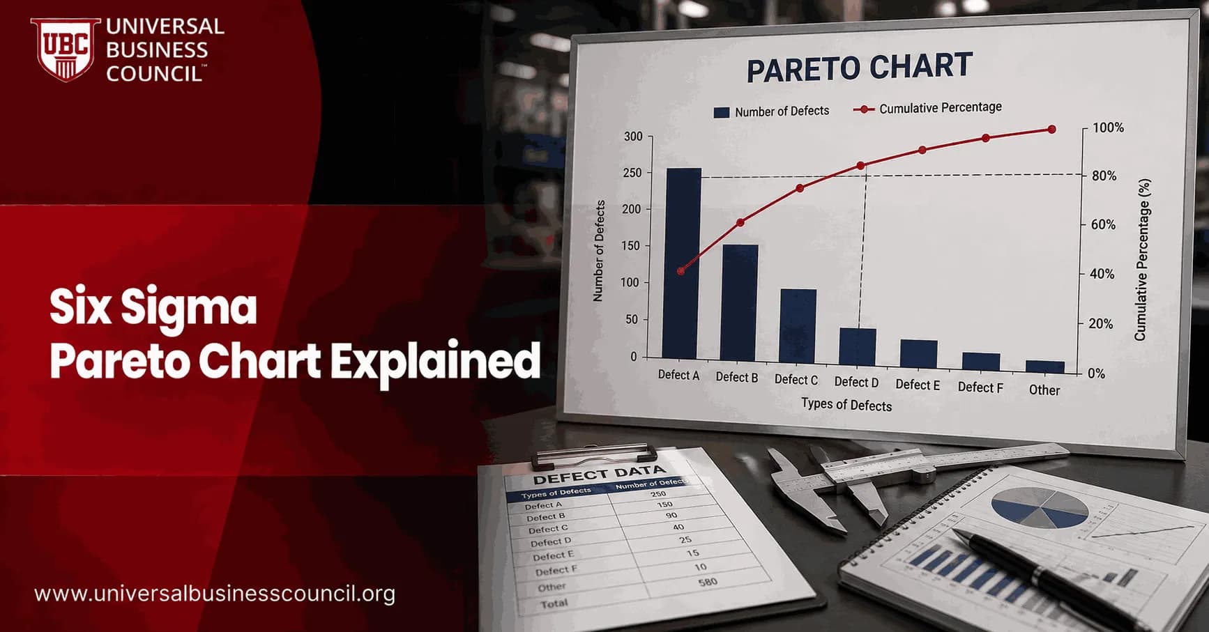
A Six Sigma Pareto chart helps you decide which process problems deserve attention first. It ranks defects, delays, complaints, or costs from largest to smallest, then adds a cumulative percentage line so the vital few problems stand out from the trivial many. For professionals building structured expertise in process improvement and quality management, a Certified Six Sigma Expert pathway can provide a practical foundation for applying Pareto analysis within real DMAIC projects.
That sounds simple. It is. The value sits in the discipline behind it: clear categories, reliable counts, and a decision rule that keeps teams from chasing whatever problem was loudest in the last meeting.

What Is a Six Sigma Pareto Chart?
A Pareto chart is a combined bar-and-line graph. The bars show categories in descending order, usually by frequency, cost, downtime, or another business impact measure. The line shows the cumulative percentage of the total as you move from left to right.
For professionals who want to connect Six Sigma practice with broader leadership and organizational skills, Management Certifications can complement this learning by strengthening the management capabilities needed to prioritize problems, coordinate improvement teams, and turn analysis into action.
The idea comes from the Pareto principle, often called the 80/20 rule. In quality improvement, it means a small number of causes tend to create most of the defects or losses. Joseph Juran popularized the language of the vital few and the trivial many in quality management, and the concept still sits at the centre of Lean Six Sigma training.
In DMAIC, the Pareto chart shows up most often in the Analyze phase. You use it after measurement has produced usable data, but before the team commits time and money to fixes.
Why the Pareto Chart Matters in Six Sigma
Six Sigma work is not about fixing everything at once. That is how projects drift. A good Pareto chart forces a sharper conversation: which problem, if fixed, will move the metric that leadership actually tracks?
That metric might be scrap cost, first-pass yield, customer complaint volume, missed SLA rate, or downtime hours. Pick the wrong metric and you can optimize the wrong thing. Ranking defects by count may point you at minor documentation errors, while ranking by cost may reveal that a less frequent machine stoppage is the real profit leak. On the floor, that difference is everything. A five-minute label correction is not the same problem as a 47-minute unplanned press stoppage sitting idle while it waits for maintenance authorization.
How to Build a Six Sigma Pareto Chart
Use a simple structure. Excel, Google Sheets, Minitab, and most BI tools can draw the chart, but the thinking matters more than the software.
Define the problem. Be specific. Use a statement such as "customer onboarding errors in Q2" or "packaging line downtime in March," not "quality issues."
Choose categories. These may be defect type, work cell, shift, supplier, transaction error, complaint reason, or failure mode.
Set the measurement rule. Decide whether you will count frequency, total cost, minutes lost, claims value, or another measure.
Collect data consistently. Use the same definition every time. If two supervisors classify the same issue differently, your chart is already damaged.
Sort categories from highest to lowest. The biggest contributor belongs on the left.
Calculate each category percentage. Divide the category total by the grand total.
Calculate cumulative percentage. Add each category percentage to the running total of all previous categories.
Plot bars and the cumulative line. Bars use the left axis. The cumulative percentage line usually uses the right axis.
A practical formula
If cell B2 contains the count for the first category and B10 contains the grand total, the percentage is =B2/$B$10. If C2 contains that percentage, the cumulative percentage in D2 is =C2. In D3, use =D2+C3, then copy down.
How to Interpret the Cumulative Percentage Line
The cumulative line answers one question: how much of the total problem is explained by the categories so far?
Many teams look for the point where the line reaches roughly 80 percent. The categories to the left are treated as the vital few. The rest may be monitored, grouped, or deferred.
Do not treat 80 percent as a law. Use judgment. In a regulated healthcare process, a category representing 8 percent of errors may still demand action if patient safety is involved. In a low-risk back-office process, you may stop at the top two categories if they explain 72 percent of rework and budget is tight.
Common Mistakes That Weaken Pareto Analysis
Using vague categories: "Other" should not be the biggest bar. If it is, recode the data.
Mixing time periods: Do not compare one category collected over a month with another collected over a quarter.
Counting frequency only: A high-volume issue may be cheap. A low-volume failure may destroy margin.
Ignoring measurement variation: If operators classify defects differently by shift, validate the data first.
Stopping at the chart: A Pareto chart prioritizes problems. It does not prove root cause.
Where Pareto Charts Fit with Other Six Sigma Tools
After you identify the vital few, go deeper with root cause analysis. A cause-and-effect diagram can structure possible causes. The 5 Whys can test the chain of logic. Hypothesis testing can confirm whether a suspected factor is statistically meaningful. Control charts can show whether the process is stable before and after improvement.
For Universal Business Council learners, this connects the Pareto chart with related Six Sigma topics such as DMAIC, root cause analysis, process capability, control charts, and Lean waste reduction. If you are preparing for a Six Sigma certification, expect questions that test interpretation, not just chart definitions. Candidates often miss items where the largest frequency category is not the best priority because cost or risk is the selected measure.
When Not to Use a Pareto Chart
Use a Pareto chart when you have categorical data and a clear measure of impact. Do not force it onto continuous data such as cycle time readings unless you first create meaningful categories. Avoid it when the data set is too small. Three incidents in a week rarely justify a confident priority decision.
One more caution. A Pareto chart shows association with categories, not causation. If the night shift has more defects, the shift itself may not be the cause. It could be product mix, staffing level, maintenance schedule, or incoming material quality.
For technology-heavy operations, the categories in a Pareto analysis may include software failures, infrastructure issues, data-quality problems, security events, or system dependencies. Deep Tech Certification can provide complementary exposure to emerging technologies and help professionals better understand the technical context behind these process problems.
Next Step for Professionals
Build one Pareto chart from a real process this week. Use cost if you can, not just counts. Then take the top category and run a short root cause session using a fishbone diagram or 5 Whys. If you are pursuing a Universal Business Council Six Sigma learning path, practice explaining why you chose the vital few and what evidence you would collect before recommending a fix.
As improvement teams increasingly work with analytics platforms, automated workflows, software systems, and technology-enabled processes, broader technical knowledge can also be useful. A Tech Certification pathway can complement Six Sigma expertise with additional technology-focused learning.
FAQs
1. What is a Pareto chart in Six Sigma?
A Pareto chart is a problem-prioritization tool used in Six Sigma to identify which defect categories, causes, complaints, or process issues contribute most to an overall problem.
It combines:
Bars → Frequency, cost, defects, or another measure
Line → Cumulative percentage
Categories are normally arranged from largest to smallest, making the biggest contributors immediately visible.
The objective is straightforward: focus improvement resources on the problems producing the greatest impact instead of treating every issue as equally urgent, a habit organizations maintain with surprising stamina.
2. What is the Pareto Principle in Six Sigma?
The Pareto Principle, often called the 80/20 rule, suggests that a relatively small number of causes may account for a large proportion of results.
In quality improvement, this is commonly expressed as:
Vital Few Causes → Large Share of Problems
Useful Many Causes → Smaller Share of Problems
The 80/20 ratio is not a mathematical law. Real data might produce 70/30, 85/15, or something entirely different.
The important idea is unequal contribution, not forcing every dataset to impersonate 80/20.
3. Why are Pareto charts important in Six Sigma?
Pareto charts help teams decide where improvement effort should begin.
They can help identify:
Most frequent defects
Largest sources of complaints
Major causes of downtime
Highest-cost failures
Most common transaction errors
Largest sources of rework
Major delay categories
When resources are limited, prioritizing the largest contributors can produce substantially greater results than distributing effort evenly across every problem.
4. When are Pareto charts used in DMAIC?
Pareto charts are particularly useful during Measure and Analyze:
Define → Measure → Analyze → Improve → Control
During Measure, a Pareto chart can identify which problem categories dominate baseline performance.
During Analyze, it can help prioritize causes or locations requiring deeper investigation.
During Improve, teams can compare pre-improvement and post-improvement Pareto charts to see whether major contributors have changed.
5. How do you create a Six Sigma Pareto chart?
A practical process is:
Step 1: Define the problem.
Step 2: Select meaningful categories.
Step 3: Collect reliable data.
Step 4: Calculate the total for each category.
Step 5: Sort categories from highest to lowest.
Step 6: Calculate each category's percentage.
Step 7: Calculate cumulative percentages.
Step 8: Create bars for category totals.
Step 9: Add the cumulative-percentage line.
Step 10: Identify categories deserving further investigation.
Software can handle steps 4 through 9 rather efficiently. Humans are still needed for the inconvenient questions about whether the categories and data make sense.
6. How do you calculate percentages for a Pareto chart?
Suppose a process records 200 total defects:
Defect Type | Defects |
|---|---|
Incorrect dimension | 80 |
Scratch | 50 |
Missing component | 30 |
Wrong label | 25 |
Other | 15 |
For incorrect dimensions:
80 ÷ 200 × 100 = 40%
For scratches:
50 ÷ 200 × 100 = 25%
Together, the first two categories account for:
40% + 25% = 65%
This helps show how much of the total problem could potentially be addressed by focusing on the largest categories.
7. What does the cumulative percentage line show?
The cumulative percentage line shows the running percentage of the total accounted for as categories are added from largest to smallest.
Using the previous example:
Category | % | Cumulative % |
|---|---|---|
Incorrect dimension | 40% | 40% |
Scratch | 25% | 65% |
Missing component | 15% | 80% |
Wrong label | 12.5% | 92.5% |
Other | 7.5% | 100% |
The line helps teams see how many categories account for a large portion of the overall problem.
8. What are the “vital few” in Pareto analysis?
The vital few are the relatively small number of categories responsible for a substantial proportion of the total effect.
For example, if three defect categories account for 78% of all defects, those categories may deserve priority.
However, “vital few” does not mean teams should automatically ignore everything else.
A low-frequency issue involving safety, regulatory compliance, severe customer impact, or catastrophic risk may require immediate action regardless of its position on the Pareto chart.
Frequency is not the same thing as importance.
9. Does a Pareto chart always follow the 80/20 rule?
No.
A Pareto analysis might reveal:
Top 20% of causes → 60% of problems
or:
Top 10% of causes → 90% of problems
The actual relationship depends on the process.
Teams should allow the data to reveal the concentration rather than searching desperately for an 80% cumulative line and declaring whatever touches it to be destiny.
The Pareto Principle is a prioritization concept, not a requirement imposed on nature.
10. What is the difference between a Pareto chart and a bar chart?
Both use bars to compare categories, but a Pareto chart has additional structure.
A bar chart may arrange categories in any meaningful order.
A Pareto chart normally:
Sorts categories from largest to smallest
Displays their relative contribution
Includes a cumulative percentage line
Therefore:
Bar Chart → Compare categories
Pareto Chart → Rank categories and prioritize major contributors
That ranking makes Pareto charts particularly useful for improvement work.
11. What is the difference between a Pareto chart and a histogram?
A Pareto chart displays categorical data.
A histogram displays the distribution of numerical data.
For example:
Pareto Chart: Defects by type
Histogram: Distribution of component diameter
Pareto bars represent distinct categories and are ranked by magnitude.
Histogram bars represent numerical intervals and normally appear in natural numerical order.
Both have bars. So do prisons. Visual resemblance does not make them analytically interchangeable.
12. How are check sheets used with Pareto charts?
A check sheet is often used to collect the raw frequency data needed for Pareto analysis.
For example:
Observe defects
↓
Record each defect on check sheet
↓
Total defects by category
↓
Sort categories
↓
Create Pareto chart
This combination is common because check sheets provide a simple, standardized collection method while Pareto charts transform those counts into visible priorities.
Reliable operational definitions are important so categories are recorded consistently.
13. How can Pareto charts support root cause analysis?
A Pareto chart helps determine which problem deserves deeper investigation, but it does not usually identify the root cause by itself.
Suppose a Pareto chart reveals:
Late approval = 45% of processing delays
The team can then investigate late approvals using:
Fishbone diagrams
5 Whys
Process mapping
Scatter plots
Regression
Hypothesis testing
A useful sequence is:
Pareto → Identify major problem
Fishbone/5 Whys → Generate potential causes
Data analysis → Validate root causes
Pareto analysis narrows the battlefield. It does not solve the battle through bar height.
14. Can Pareto charts prioritize problems by cost instead of frequency?
Yes, and sometimes they should.
A Pareto chart can rank categories using measures such as:
Frequency
Financial loss
Rework hours
Scrap cost
Downtime
Customer impact
Warranty expense
Delay minutes
For example:
Defect A: 500 occurrences × $5 = $2,500
Defect B: 50 occurrences × $500 = $25,000
A frequency-based Pareto chart would prioritize A, while a cost-based chart would prioritize B.
The metric should match the business question.
15. How can Pareto charts be used for customer complaints?
Customer complaints can be categorized and ranked by frequency or impact.
For example:
Complaint | Number |
|---|---|
Late delivery | 120 |
Damaged product | 65 |
Incorrect order | 40 |
Billing error | 25 |
Other | 20 |
The chart may reveal that late delivery dominates complaints.
The team can then investigate delivery lead time, scheduling, inventory availability, carriers, warehouse processes, or other relevant causes.
This converts a vague objective like “improve customer satisfaction” into a more focused improvement problem.
16. What is a second-level Pareto chart?
A second-level Pareto chart takes the largest category from the first analysis and breaks it into more detailed subcategories.
Suppose the first Pareto identifies:
Late Delivery = largest complaint category
A second Pareto might analyze late deliveries by cause:
Warehouse delay → 40%
Carrier delay → 30%
Inventory shortage → 20%
Incorrect address → 10%
The team can continue drilling down until it reaches categories specific enough for meaningful root cause analysis.
This is considerably more useful than repeatedly announcing that “late delivery is our biggest issue.”
17. How can Pareto charts compare performance before and after improvement?
Teams can create Pareto charts for before-improvement and after-improvement data.
For example:
Before:
Incorrect dimensions = 500 defects
After process changes:
Incorrect dimensions = 120 defects
This provides evidence that the targeted problem declined.
However, teams should also examine total production volume, defect rates, time periods, and statistical evidence. Comparing raw counts from dramatically different production volumes can create a misleading victory parade.
18. What are common mistakes when using Pareto charts?
Common mistakes include:
Using unclear categories: Data becomes inconsistent.
Creating too many tiny categories: The chart becomes cluttered.
Overusing “Other”: Important problems become hidden.
Using frequency when cost or risk matters more: Priorities become distorted.
Ignoring sample size or exposure: Counts may not be comparable.
Assuming the largest category is the root cause: Problem categories and causes are confused.
Forcing the 80/20 rule: The data is made to fit the principle.
Ignoring low-frequency, high-severity risks: Serious issues may be overlooked.
Pareto charts prioritize according to the metric supplied. They do not know that one rare failure could shut down a plant or injure someone.
19. What is a practical Six Sigma Pareto chart example?
Suppose a call center records 1,000 service failures:
Problem | Cases | Percentage |
|---|---|---|
Long wait time | 380 | 38% |
Repeat contact | 250 | 25% |
Incorrect routing | 160 | 16% |
Incomplete resolution | 120 | 12% |
Other | 90 | 9% |
Cumulative percentages become:
Long wait time → 38%
+ Repeat contact → 63%
+ Incorrect routing → 79%
The first three categories account for 79% of recorded failures.
The team now has a rational starting point for improvement, although it still needs root cause analysis before implementing solutions.
20. How should Six Sigma teams use Pareto charts effectively?
An effective Pareto analysis follows a disciplined sequence:
Define the Problem
↓
Establish Clear Categories
↓
Collect Reliable Data
↓
Choose the Right Metric
↓
Rank Categories from Largest to Smallest
↓
Calculate Percentages and Cumulative Contribution
↓
Identify Major Contributors
↓
Consider Severity, Cost and Risk
↓
Drill Down with Second-Level Pareto Analysis
↓
Investigate Root Causes
↓
Implement Improvements
↓
Measure Results
↓
Repeat Pareto Analysis
The central principle is:
Do not try to solve every problem simultaneously. Identify where improvement effort can create the greatest meaningful impact.
Pareto charts are powerful precisely because most processes do not distribute problems evenly. A few categories often consume disproportionate amounts of time, money, capacity, or customer patience.
Used correctly, Pareto analysis transforms:
“We have too many problems.”
into:
“These specific problems account for most of the measurable impact, so we will investigate them first.”
That is a considerably more useful management position than launching twelve improvement projects at once and then wondering why all twelve are late.
Related Articles
View All
Six Sigma
Six Sigma Minitab Explained: Statistical Software for DMAIC Projects
Learn how Six Sigma Minitab supports DMAIC projects with capability analysis, control charts, DOE, regression, Minitab Engage, and real project results.

Six Sigma
Design for Six Sigma Explained: When to Use DFSS Instead of DMAIC
Design for Six Sigma helps teams design new products, services, and processes to meet quality targets from launch instead of fixing defects later.

Six Sigma
Six Sigma DMADV Explained: Define, Measure, Analyze, Design, Verify
Six Sigma DMADV explained through its five phases, practical use cases, DMAIC comparison, and how professionals apply it to design for quality.
Trending Articles
The Role of Blockchain in Ethical AI Development
How blockchain technology is being used to promote transparency and accountability in artificial intelligence systems.
AWS Career Roadmap
A step-by-step guide to building a successful career in Amazon Web Services cloud computing.
Top 5 DeFi Platforms
Explore the leading decentralized finance platforms and what makes each one unique in the evolving DeFi landscape.